

Rēssono Brand Identity System 2025
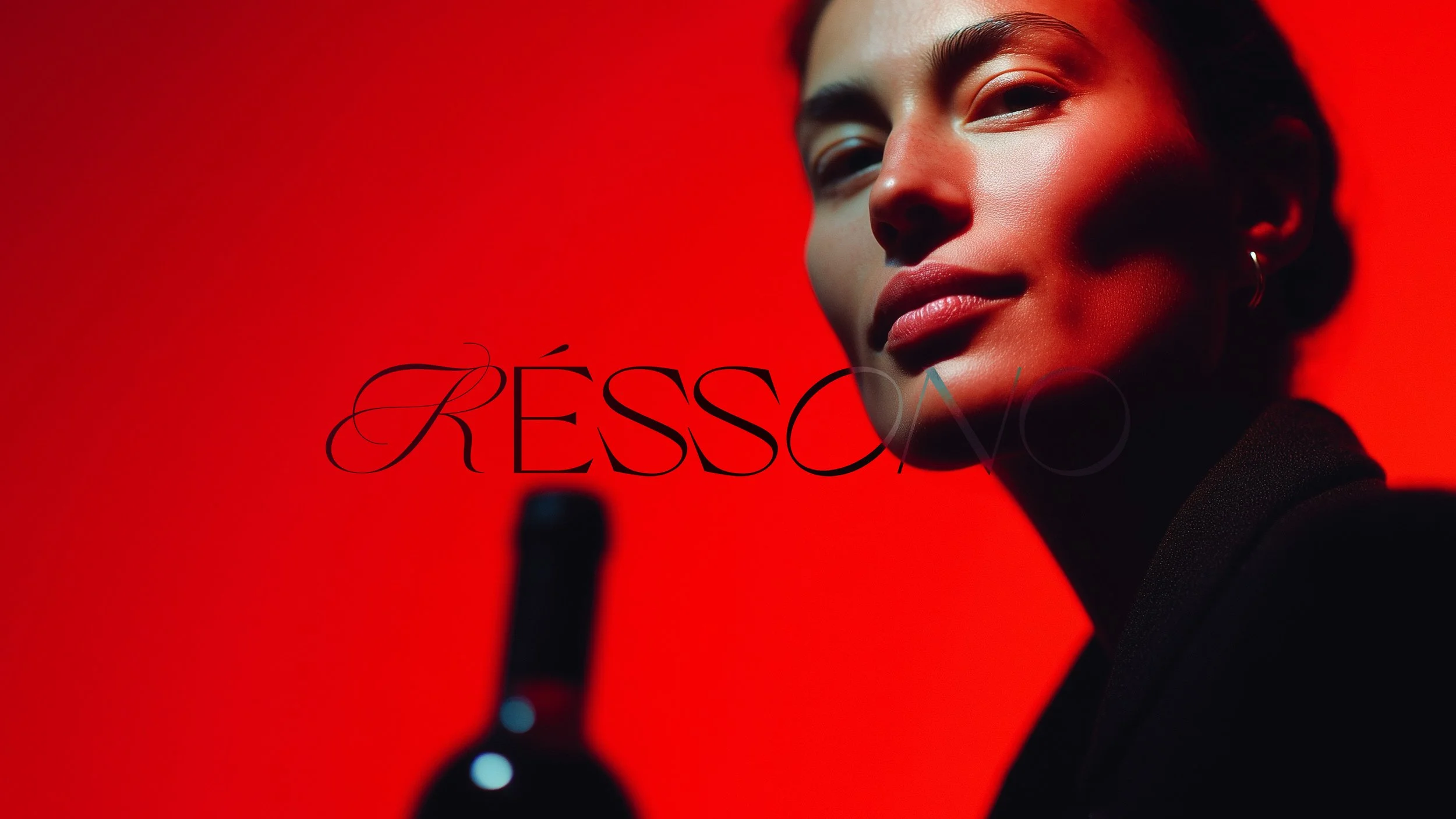
Rēssono
Wine. Art. Experience. Design.
Four worlds. One brand.
Rēssono wasn't a wine brand.
The client came with something harder to define — a cultural platform where curated wine collections, artist collaborations, guided journeys to European vineyards and an exhibition space inside the Chopin Museum at Żelazową Wolą all had to coexist under one identity.
Wine was only the beginning.
The challenge
Wine brands communicate product. Rēssono needed to communicate a world.
A conventional approach – heritage typography, muted earth tones, a crest – would have collapsed everything that made this project interesting into something predictable. The brand needed a different logic entirely.
The question wasn't what does this brand look like. It was how does this brand behave.
The idea
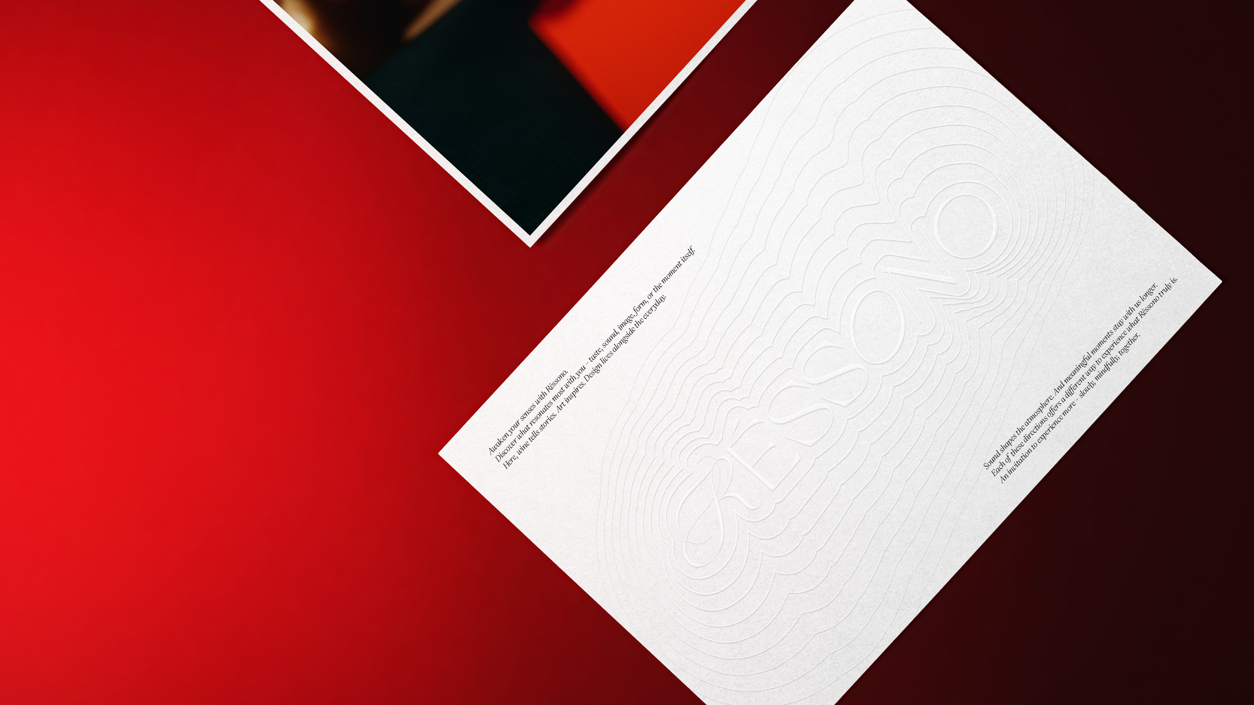
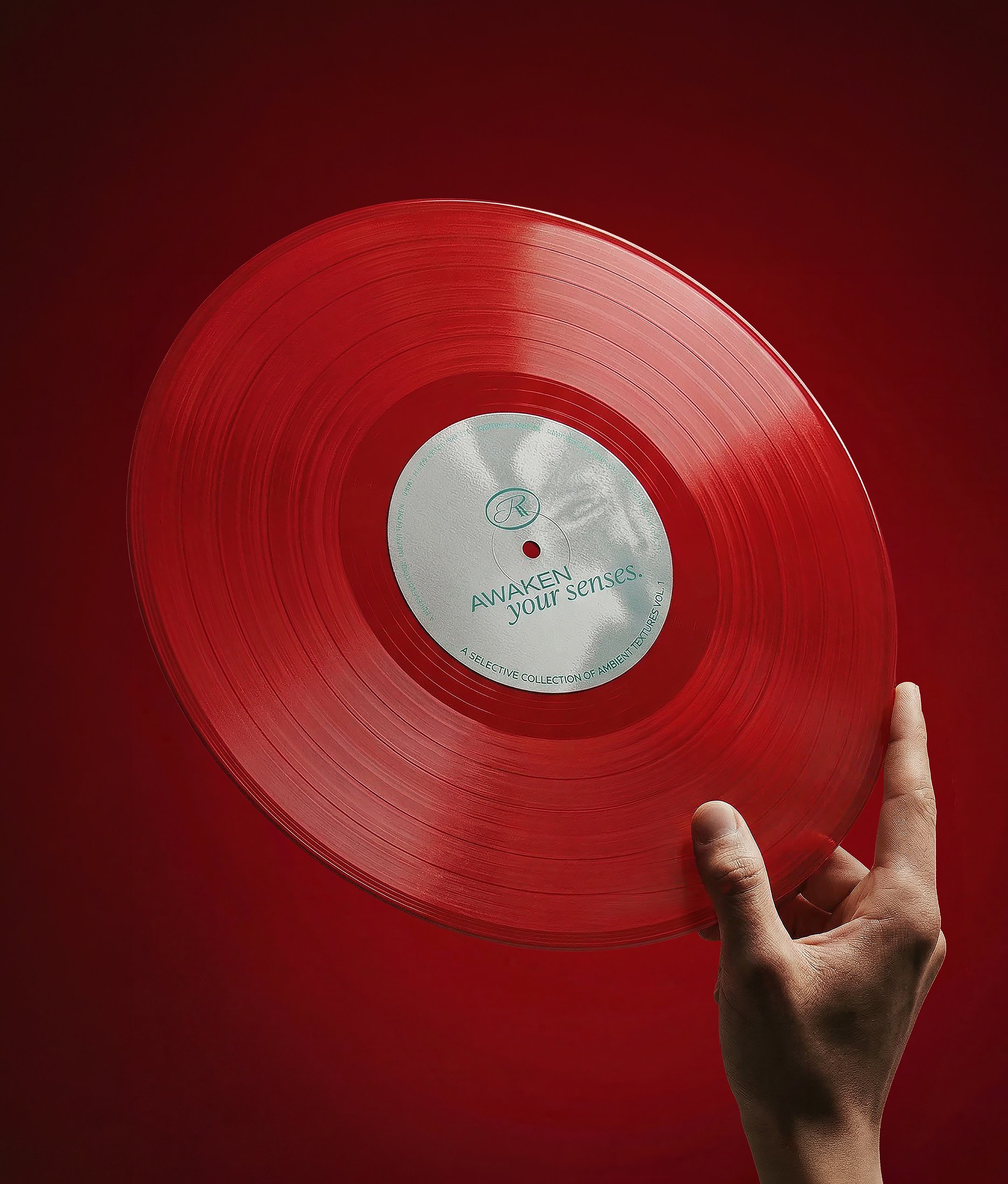
Wine leaves something behind. Not just taste — a mood, a conversation, a memory that stays with you longer than the evening itself. This is the idea that became the foundation of Rēssono: resonance. The moment that continues after it ends. The name carries it. The identity translates it.
The system
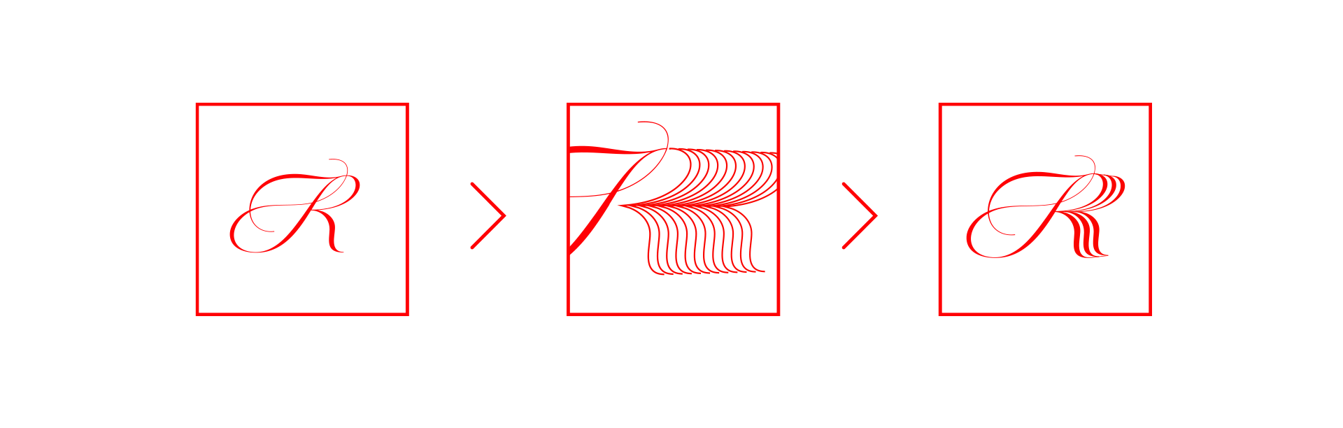
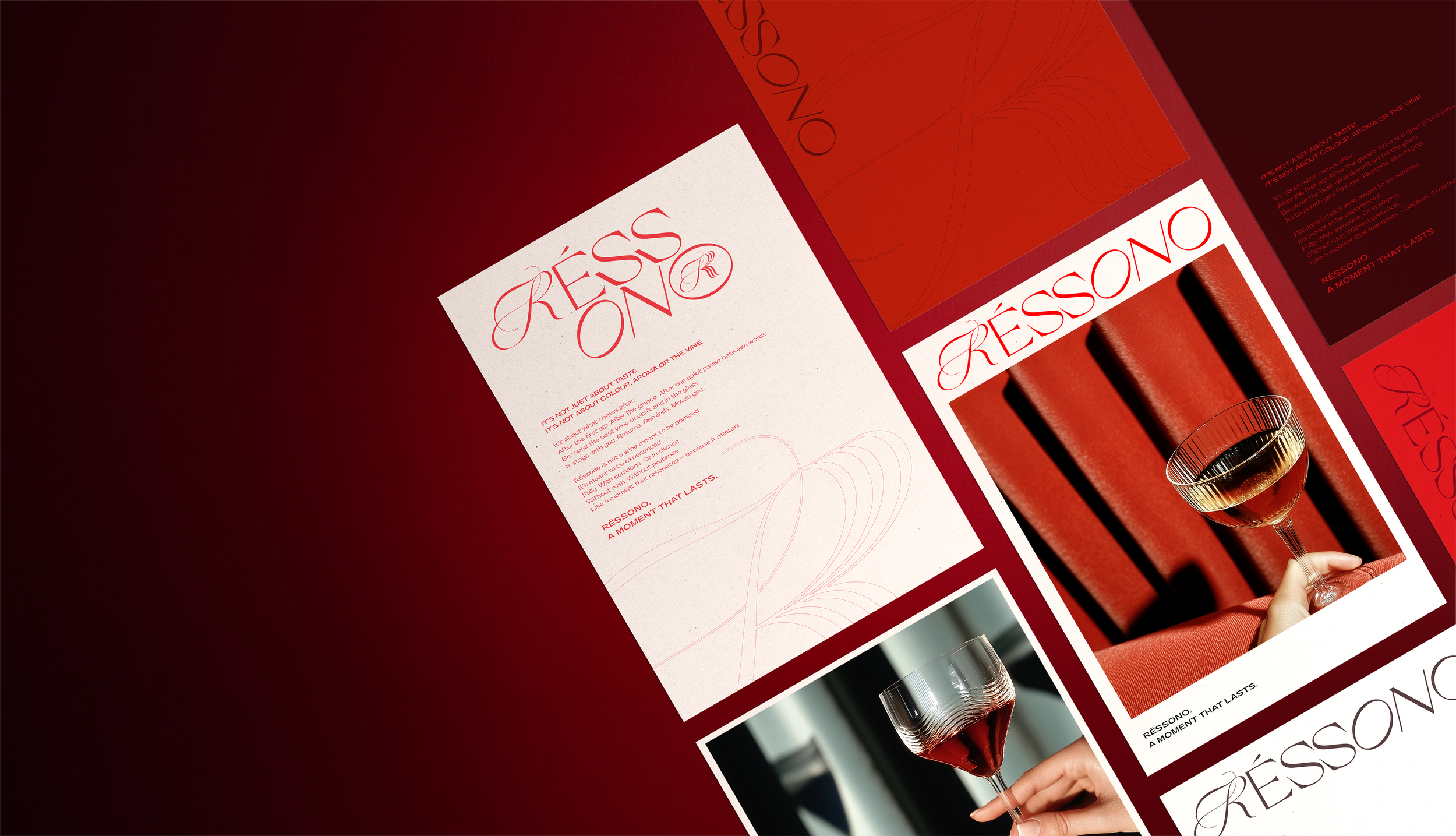
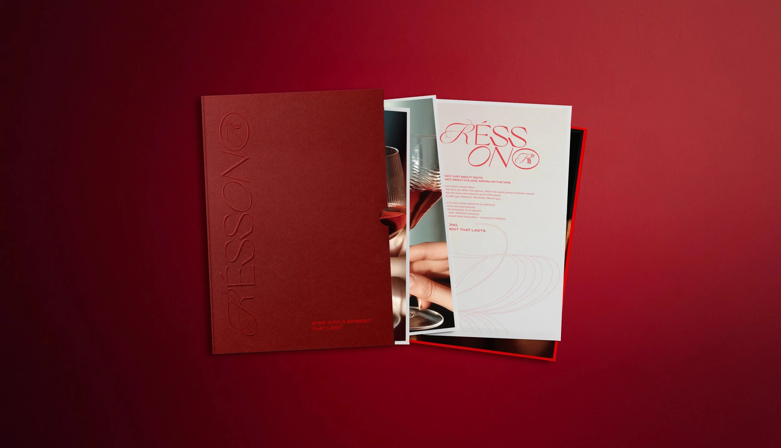
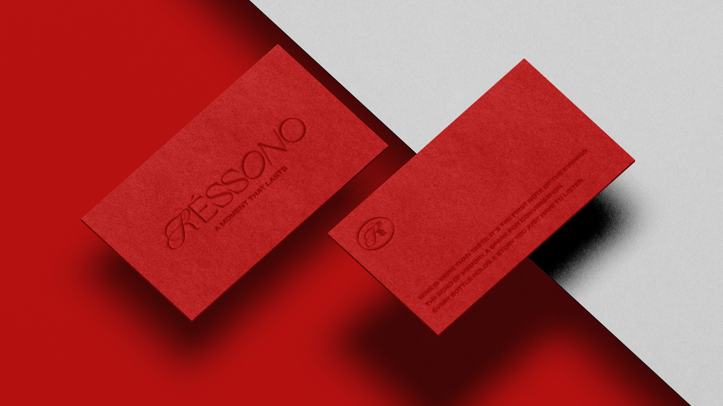
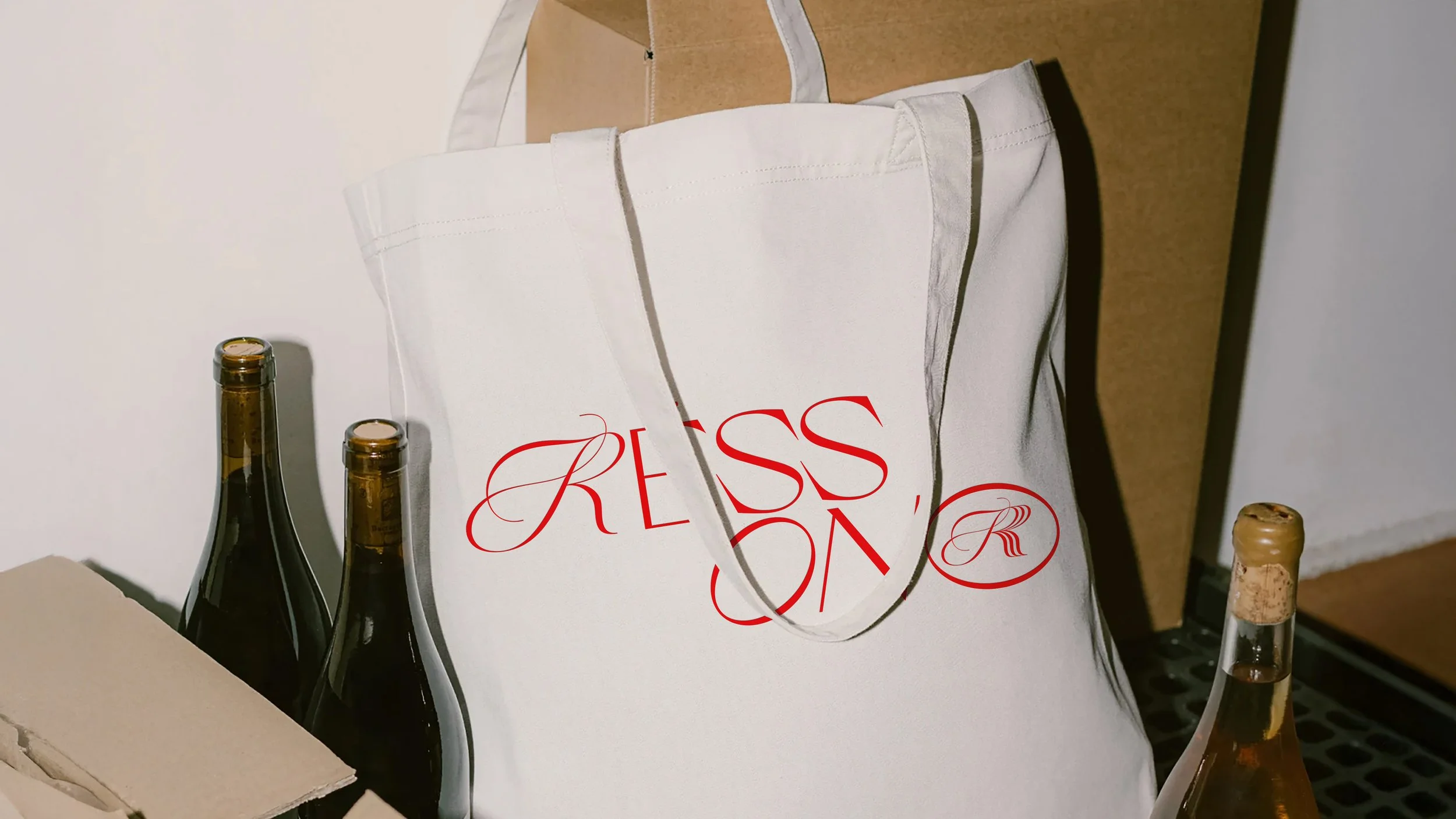
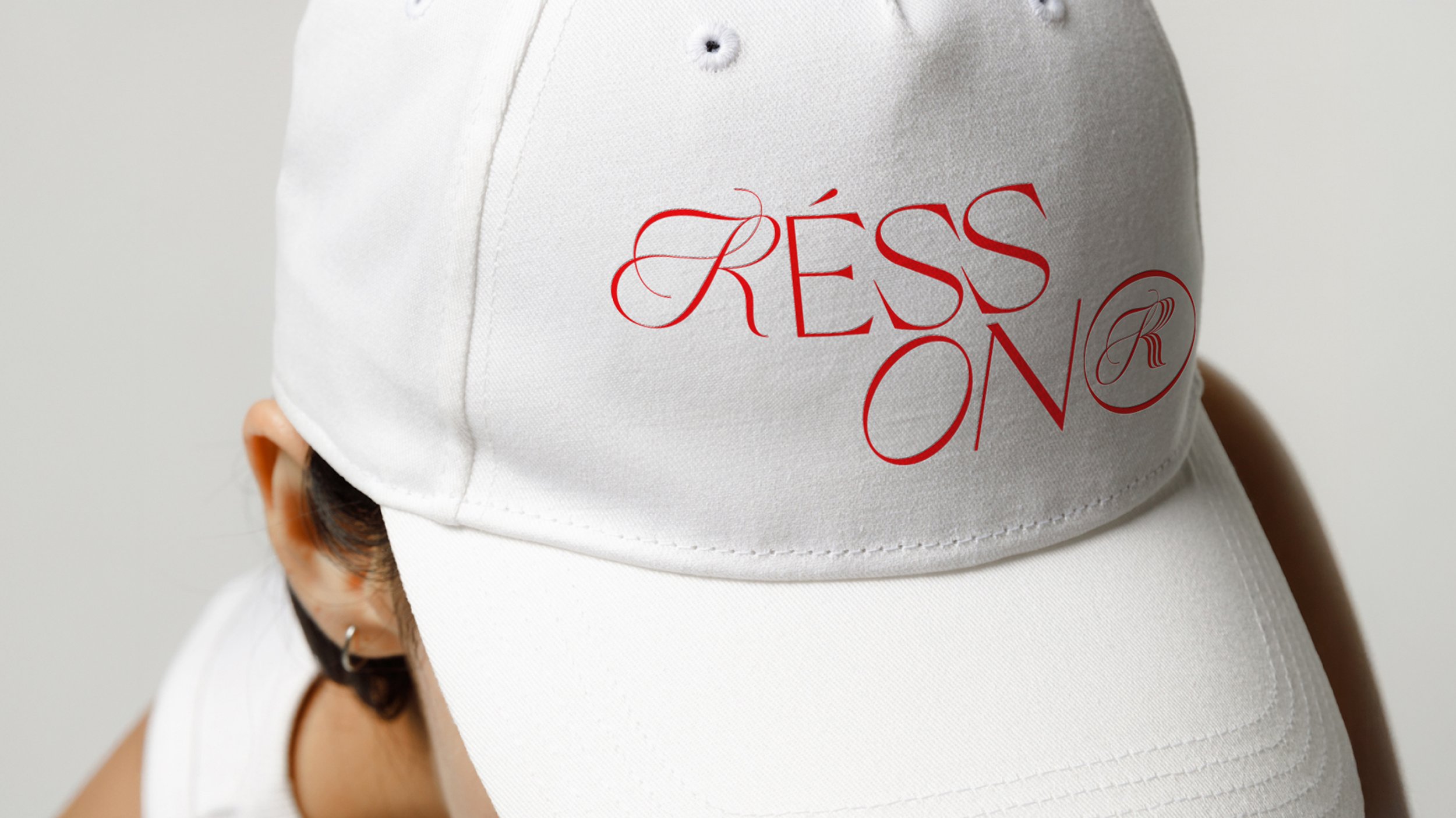
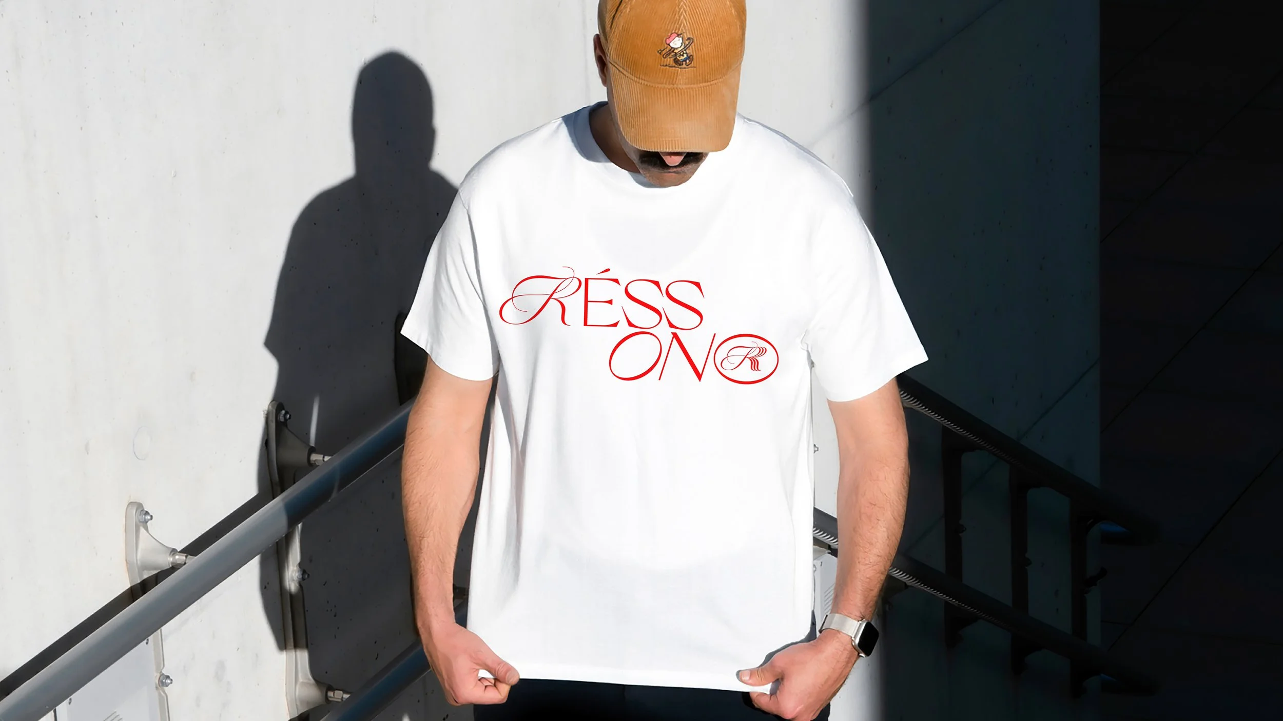
Instead of a single static mark, Rēssono was built as a signal — one that expands, echoes and repeats across formats.
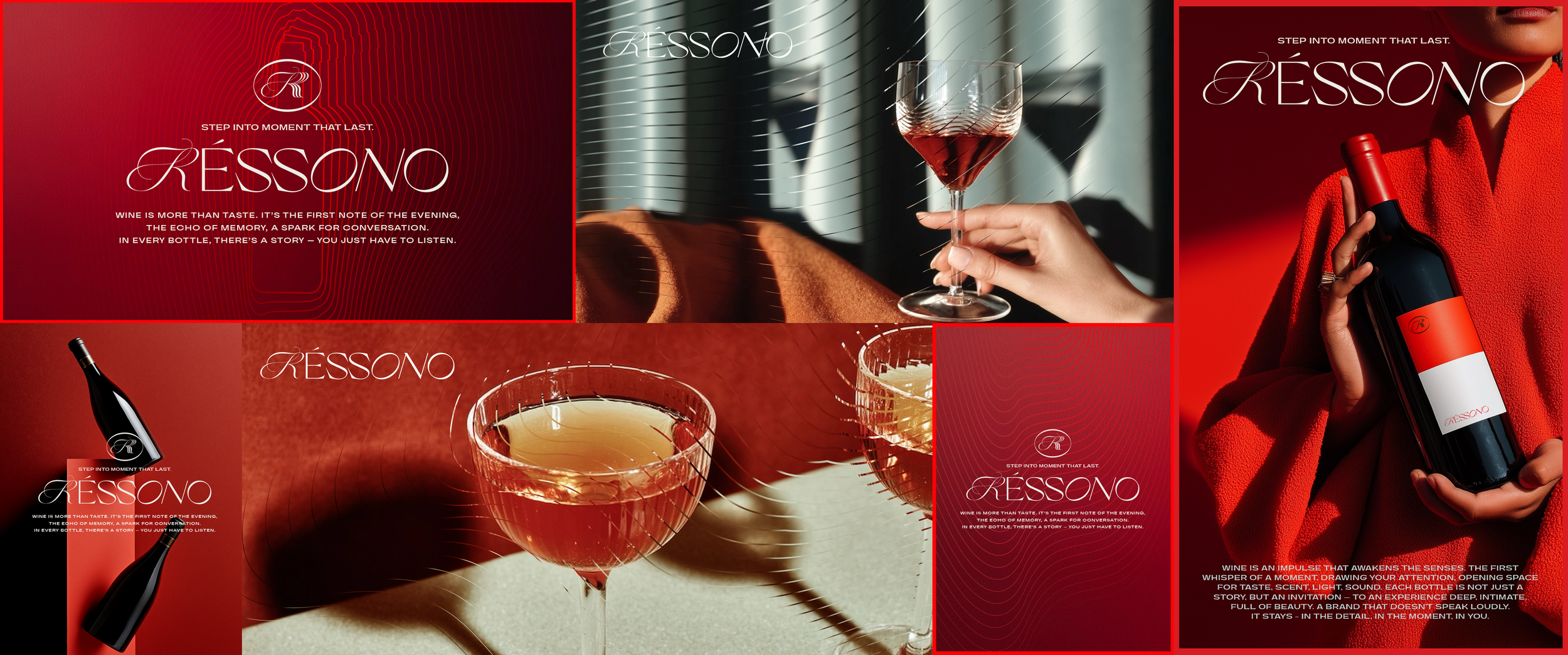
Typography extends itself. Letterforms reverberate. Structures subtly repeat across compositions, creating a sense of movement rather than stillness. The wordmark is not a stamp. It behaves like a sound spreading through a room.
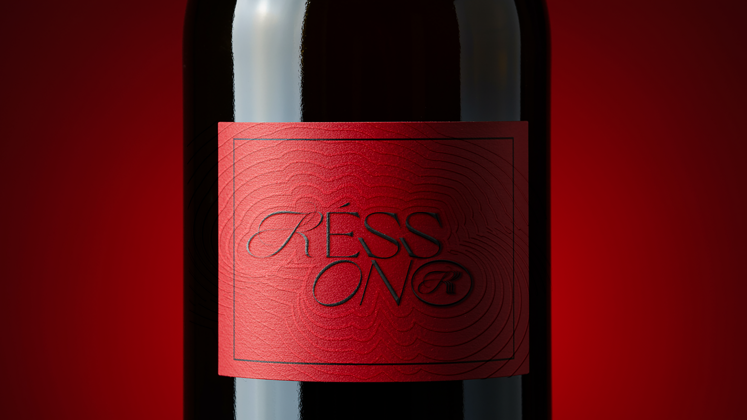
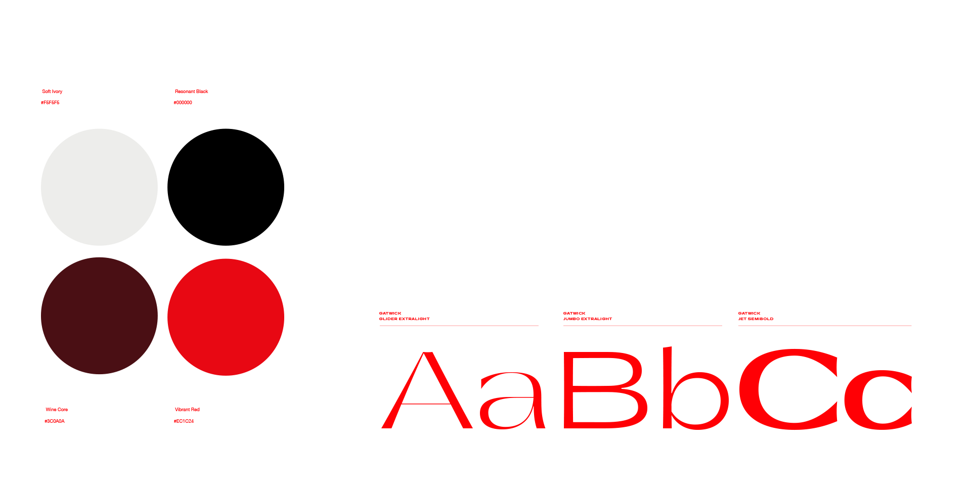
Colour and material cues are drawn from wine culture — restrained, precise, never decorative for its own sake.
Naming
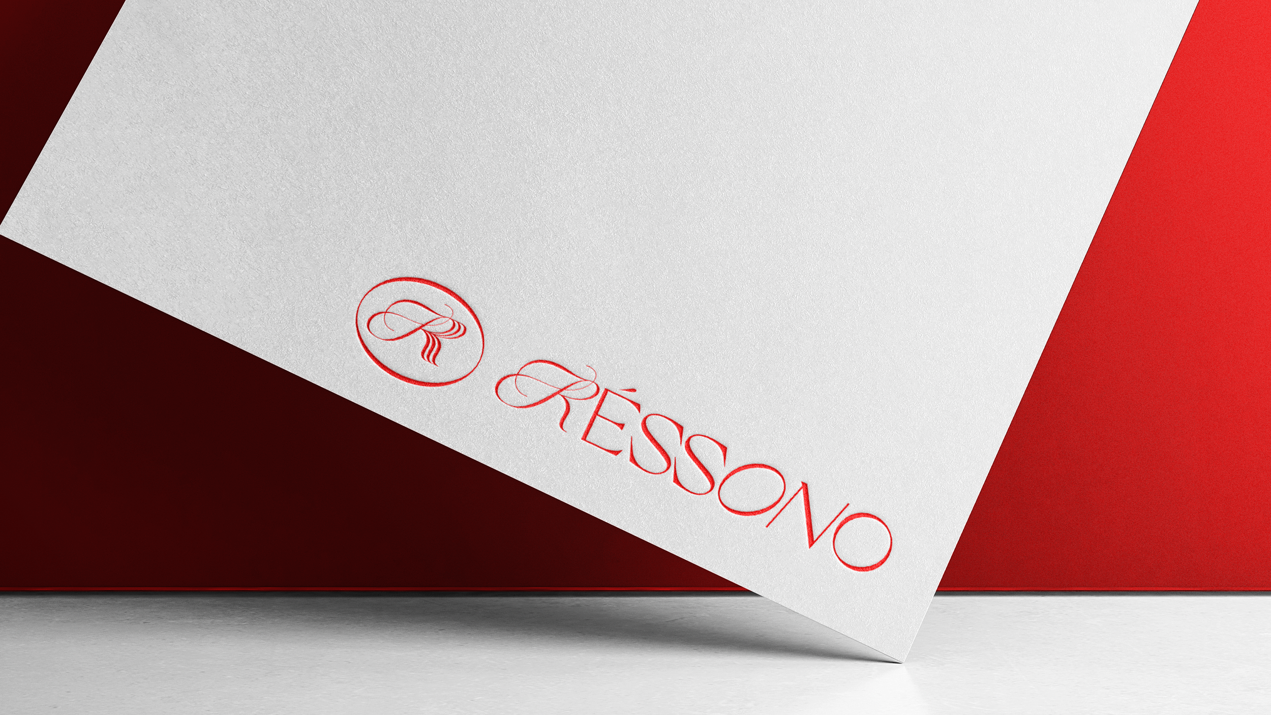
Rēssono is a constructed word — rooted in the Latin resonare, to resound. The macron over the first e is not a stylistic detail.
It slows the reader down. It marks the name as considered, as something that carries weight. It sounds like what it means.
Applications
The system was designed to hold a wide cultural ecosystem:
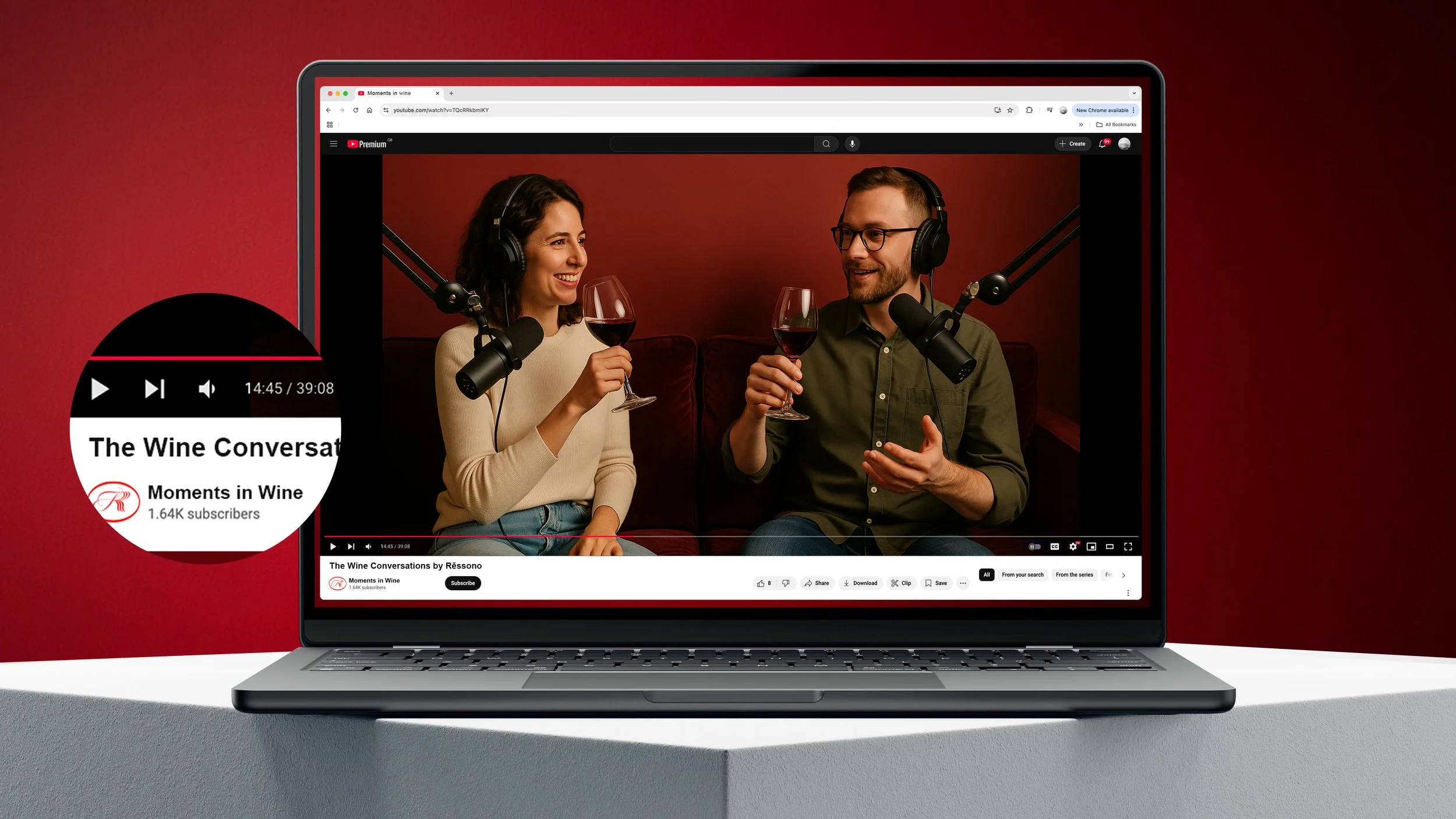
Wine collections and curated labels. Tasting events and guided vineyard journeys. Artist collaborations and exhibitions. Editorial content, digital platforms, playlists. The physical showroom at the Chopin Museum, Żelazowa Wola.
From an intimate printed invitation to a spatial installation — the identity keeps the same tone. Quiet. Precise. Resonant.
The result
Rēssono is not built around what wine is. It's built around how it stays with you. A brand that doesn't sell a product. It opens an experience – and leaves something behind.
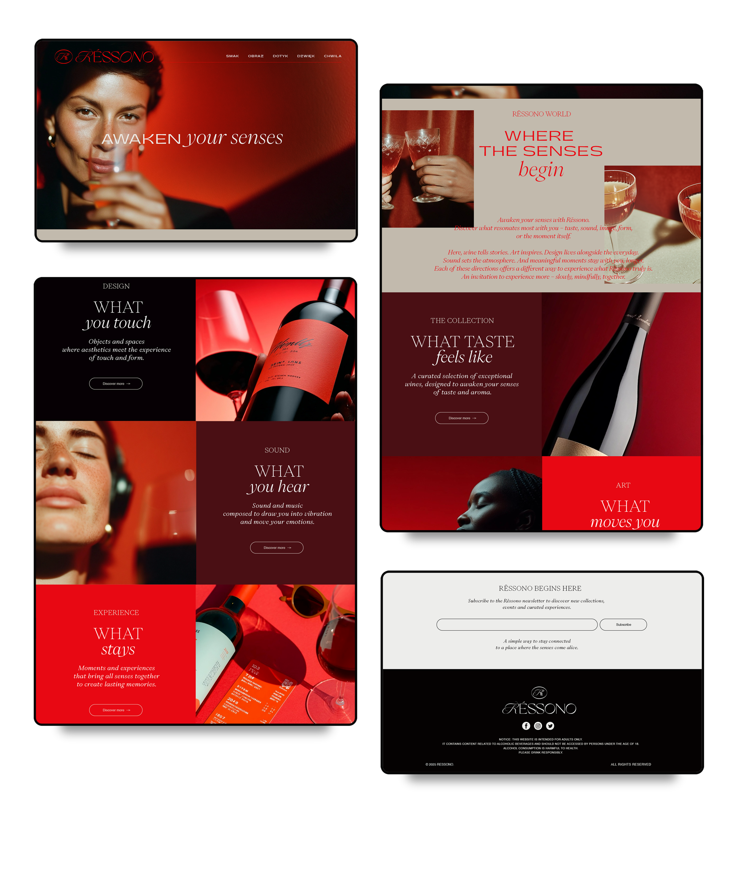
Rēssono is not built around what wine is.
It’s built around how it stays with you.

Selected projects
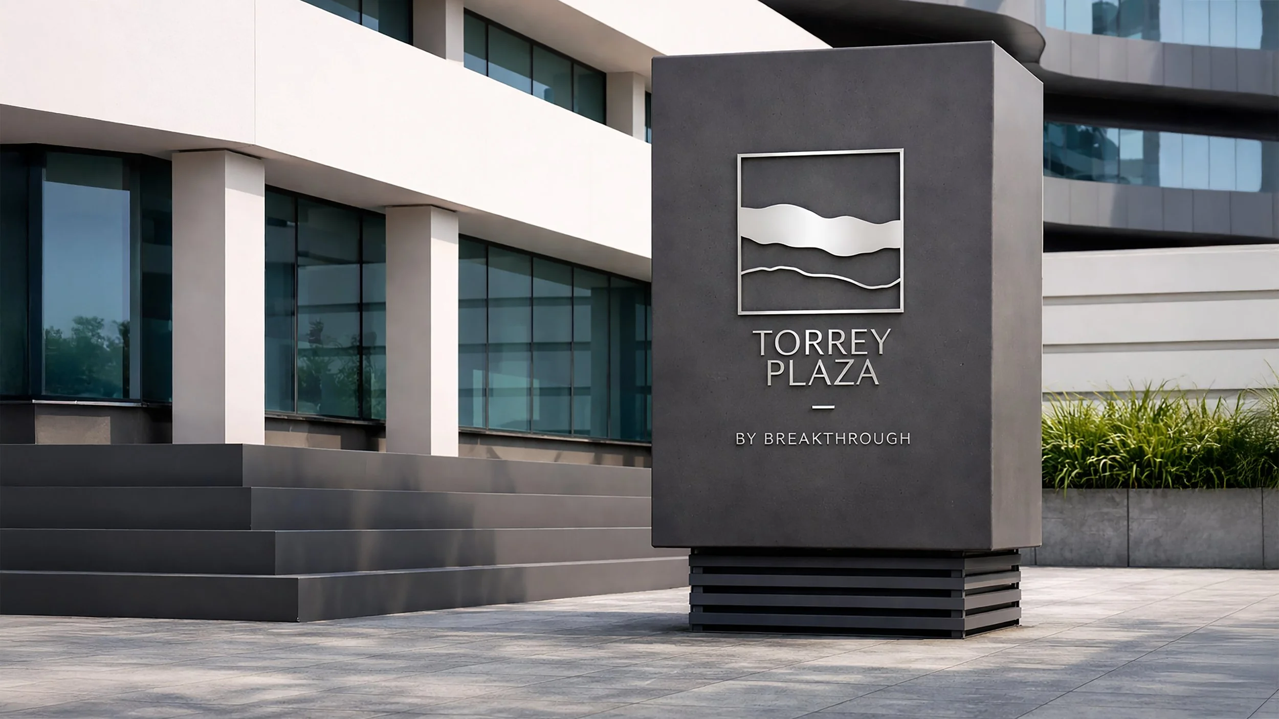
Torrey Hills
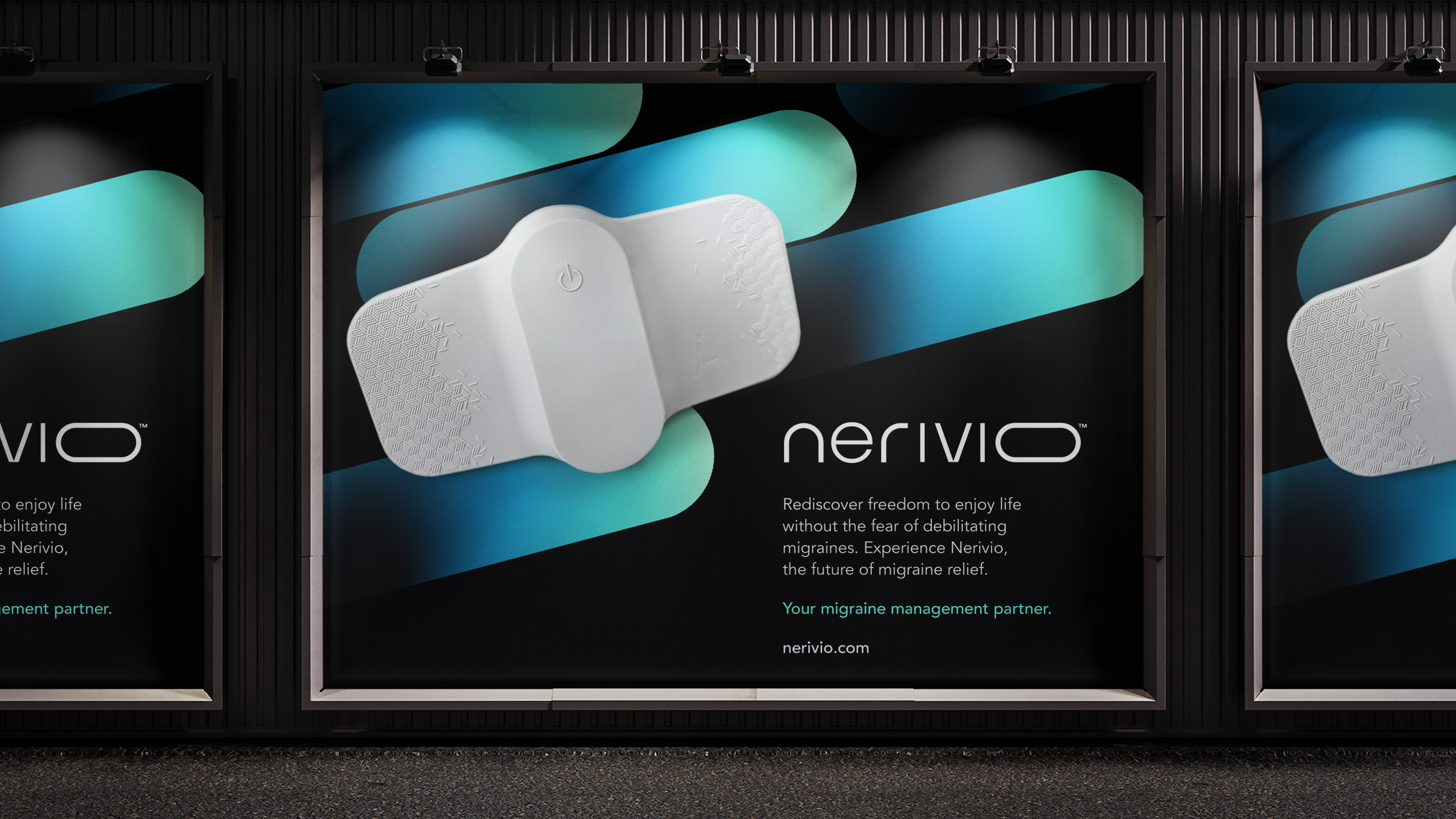
Nerivio
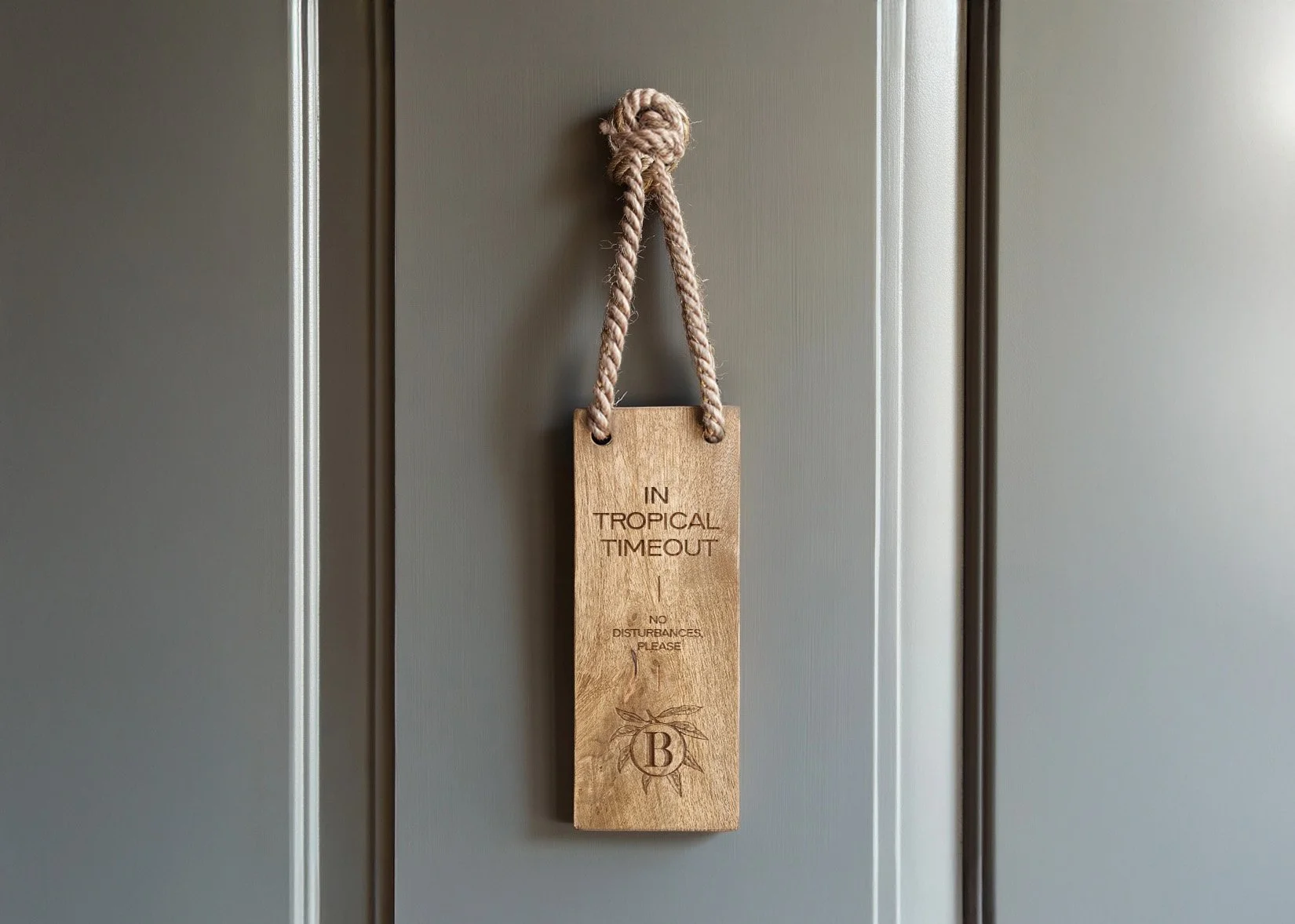
The Belgrove