

Torrey Hills Campus Brand Identity System – Breakthrough Properties San Diego, California
Torrey Hills
Two buildings. One identity.
A system built to scale.
Brief
Breakthrough Properties develops life science campuses for the world's leading biotech and pharmaceutical companies. Torrey View and Torrey Plaza — their two buildings in San Diego's Torrey Hills — needed a brand identity that could work as one unified system, while remaining distinct enough for each property to hold its own. But there was a harder problem underneath.
The problem
The existing Breakthrough identity – developed for their Boston property
– wasn't working in physical space. The graphic language was too complex, too cold, too difficult to apply across signage and wayfinding.
And there was a competitive pressure: Alexandria Real Estate, the dominant player in the San Diego life science market, was positioning around scale and authority. Bigger, louder, more institutional.
Breakthrough wanted the opposite.
Not a whale. A jewel box.
The positioning
Life science campuses are typically designed around function – labs, loading bays, infrastructure. The brand follows: clinical, corporate, anonymous.
Torrey Hills proposed something different: that the environment scientists work in shapes the work they do. That a campus which feels considered, calm and human creates better conditions for creativity than one that feels like a logistics facility.
The brief put it directly: "Science is truly a creative endeavor. We want to provide a space and format for scientists to create."
The identity needed to reflect that belief.
The idea
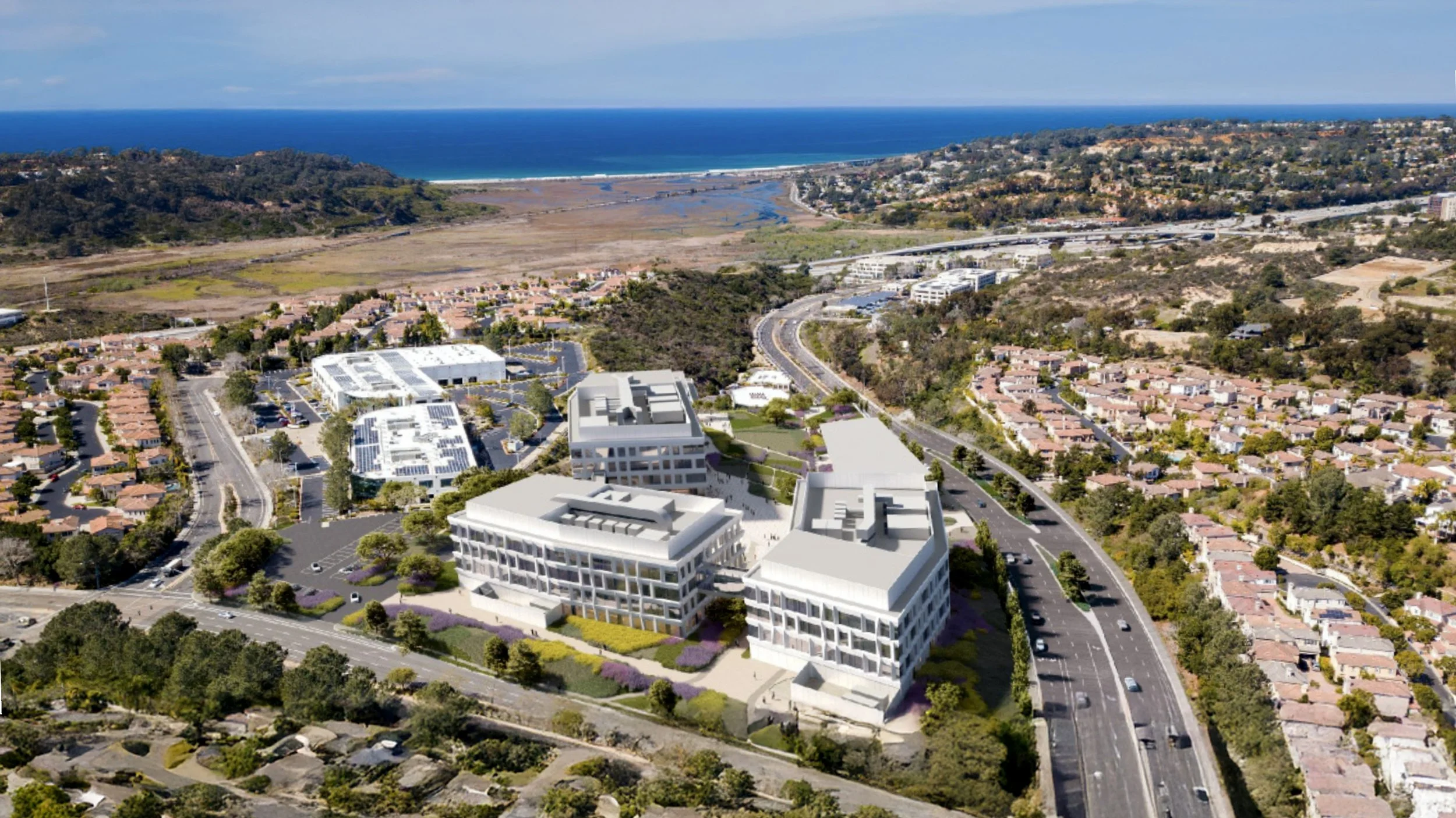
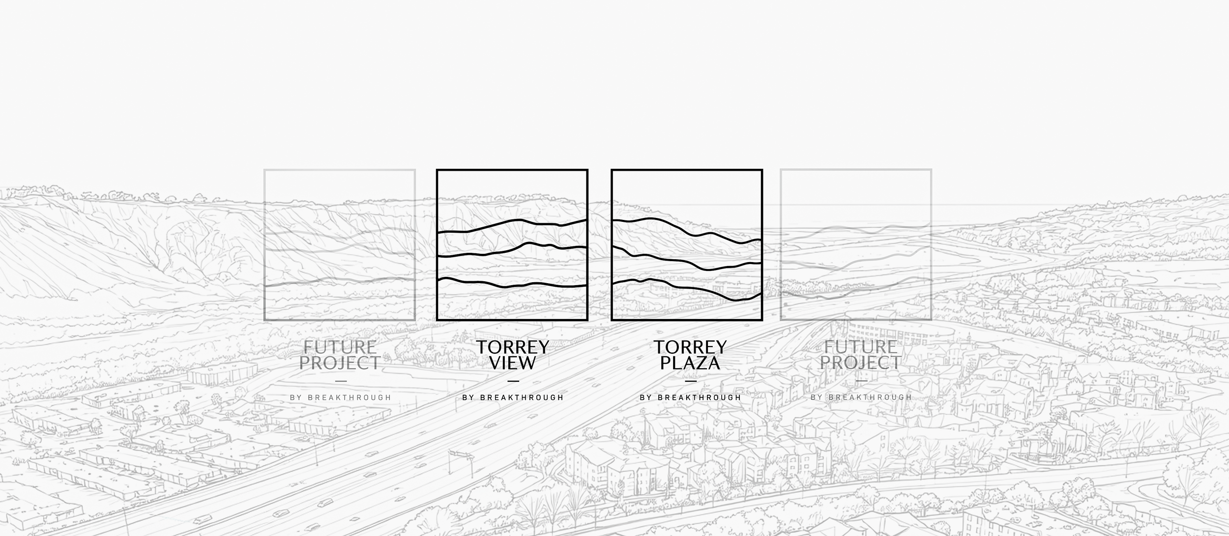
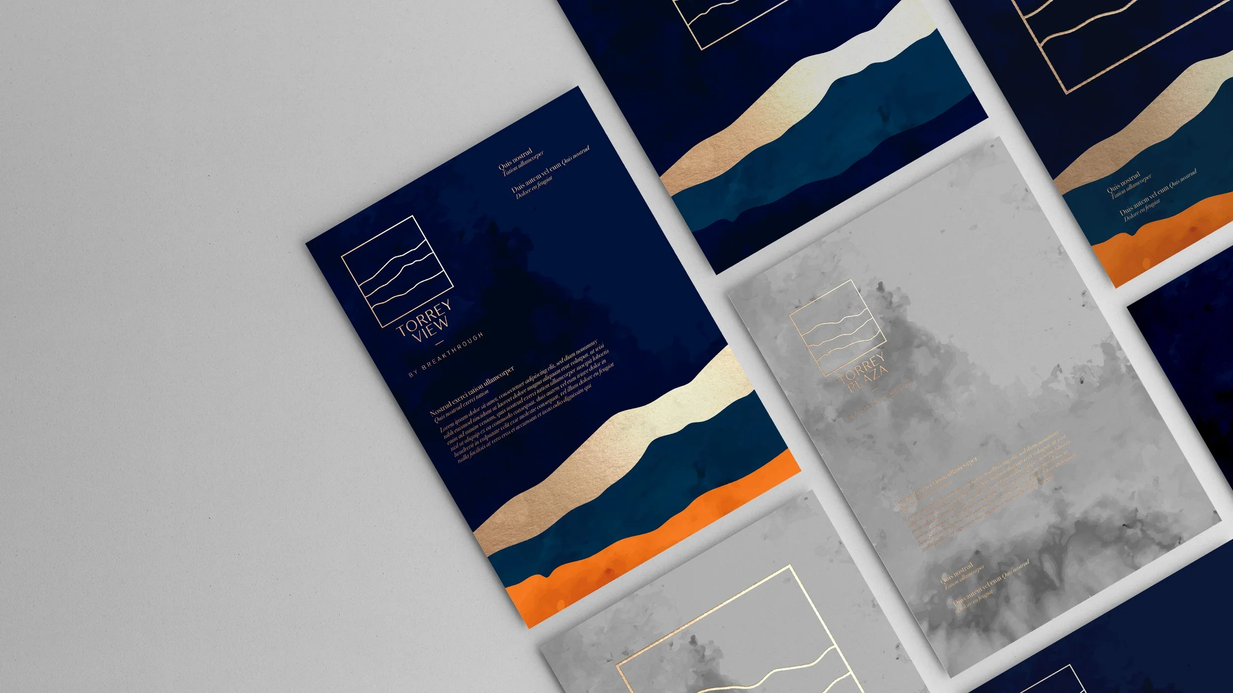
The Torrey Hills landscape is defined by one thing: the Torrey Pine – one of the rarest trees in the world, native to this specific stretch of California coast. Twisted by wind, shaped by terrain, unmistakably of this place.
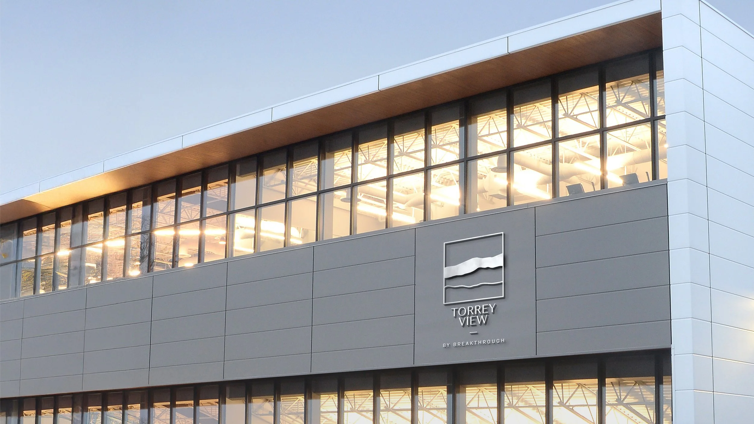
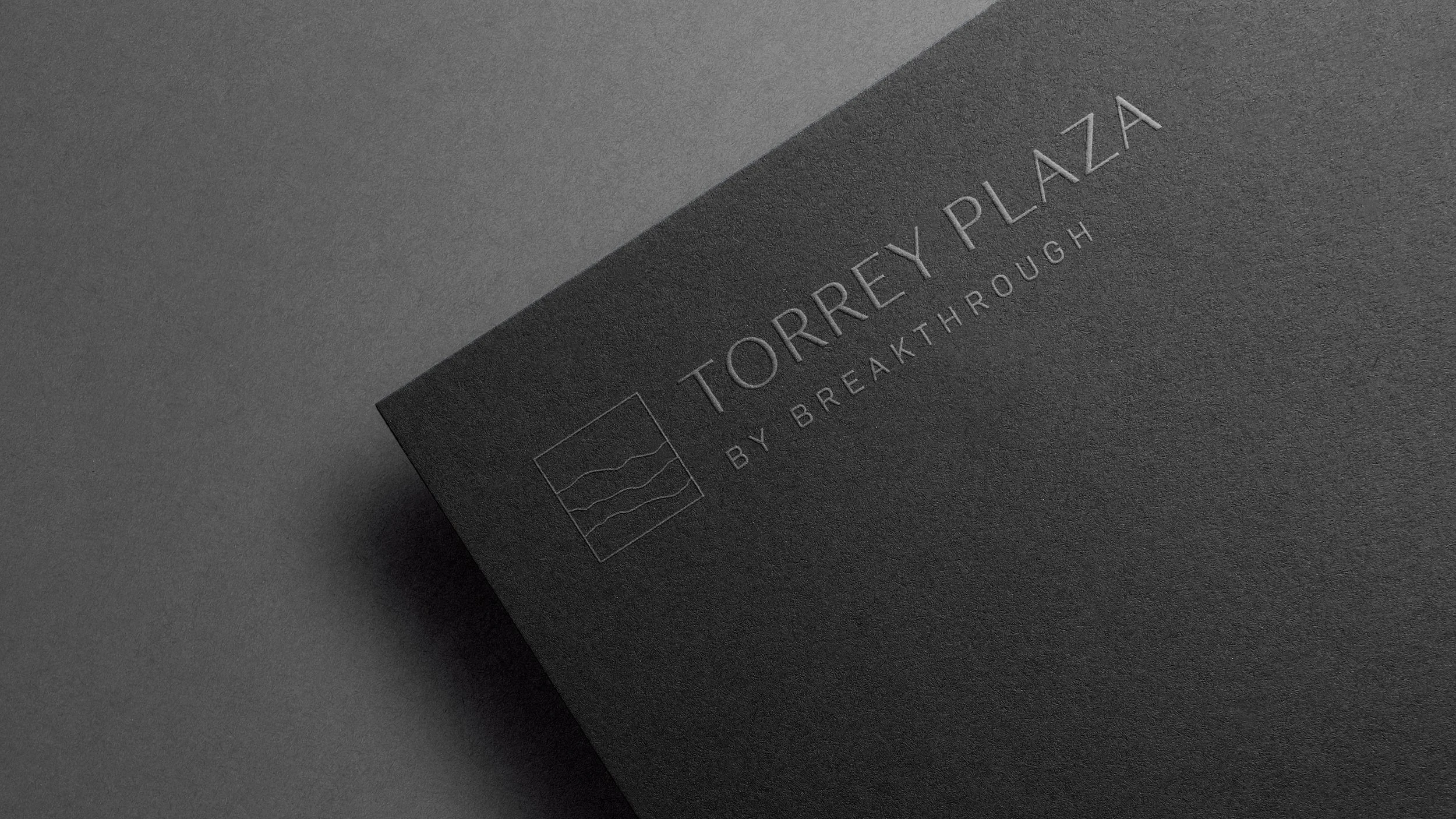
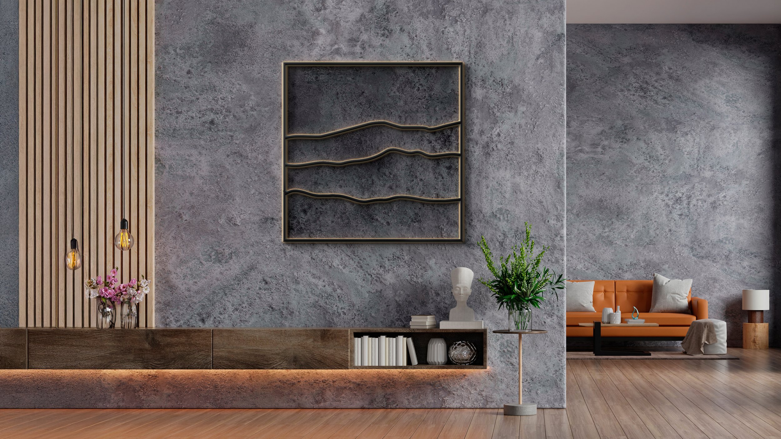
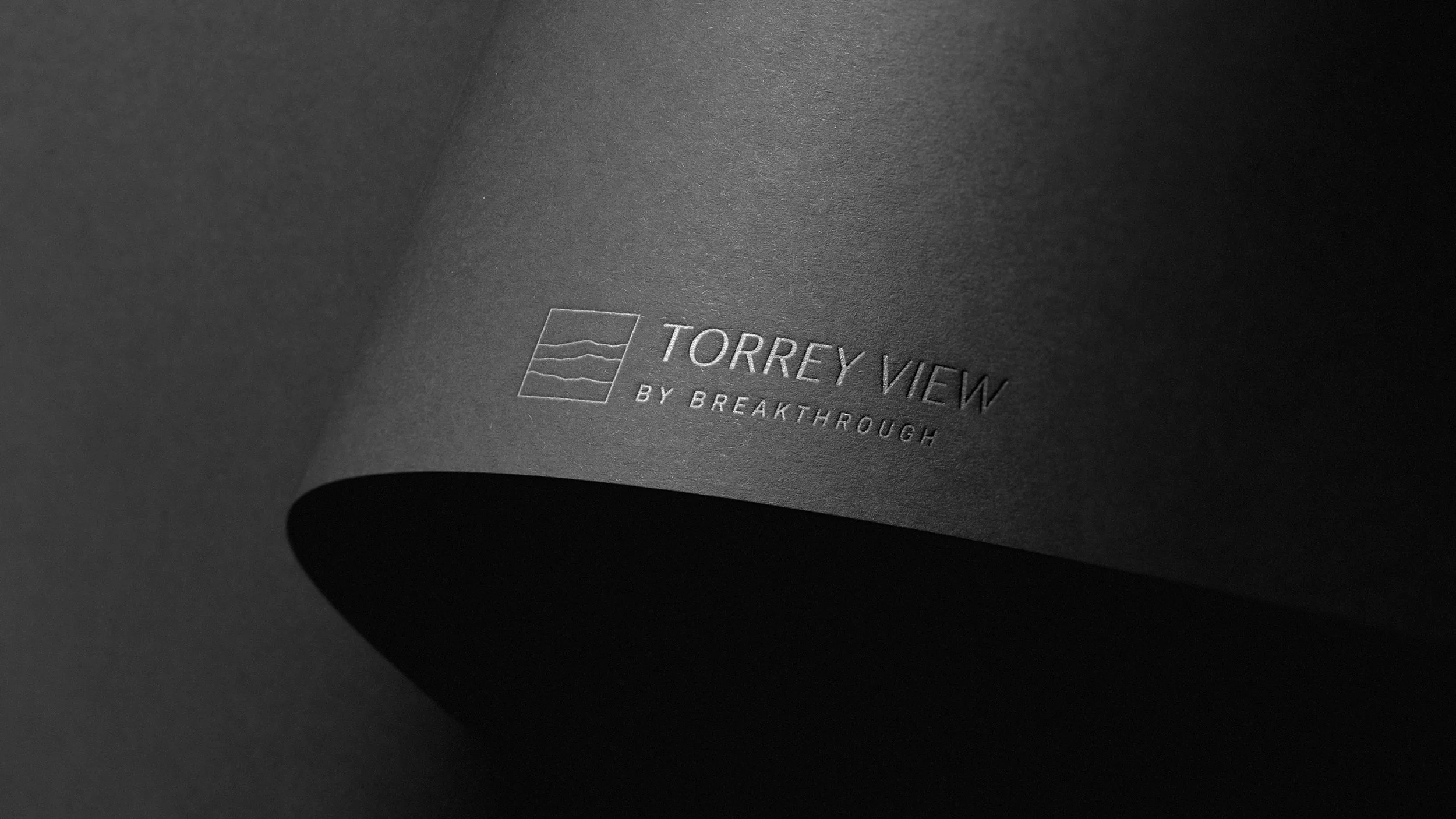
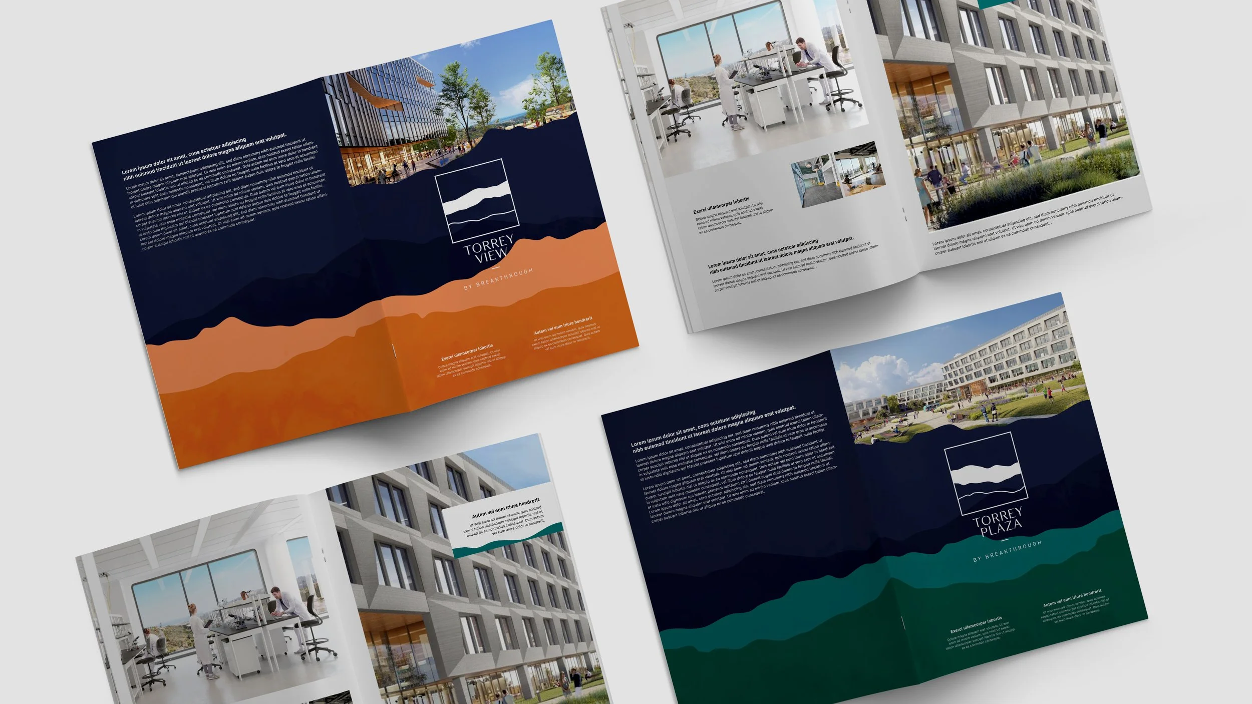
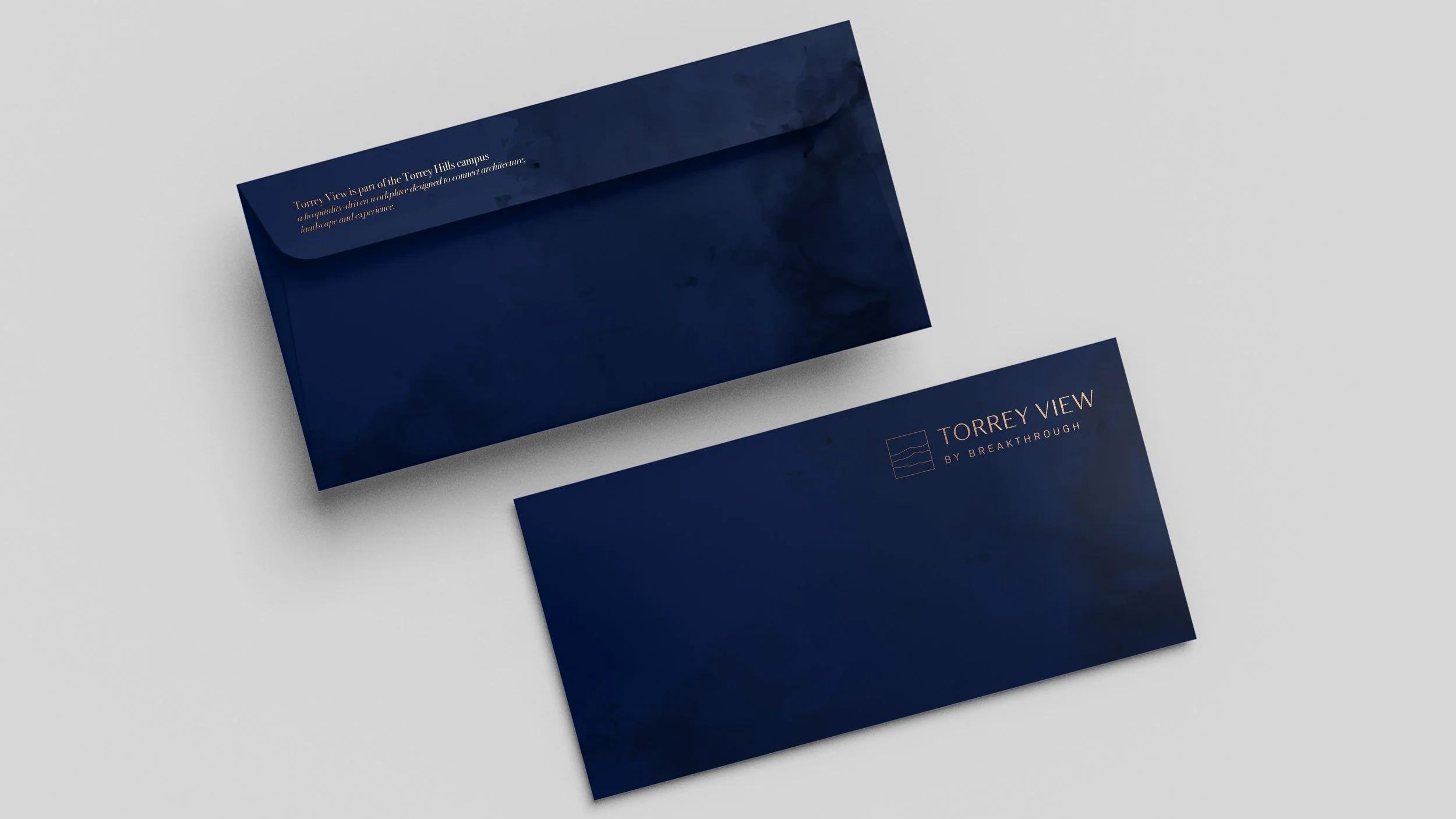
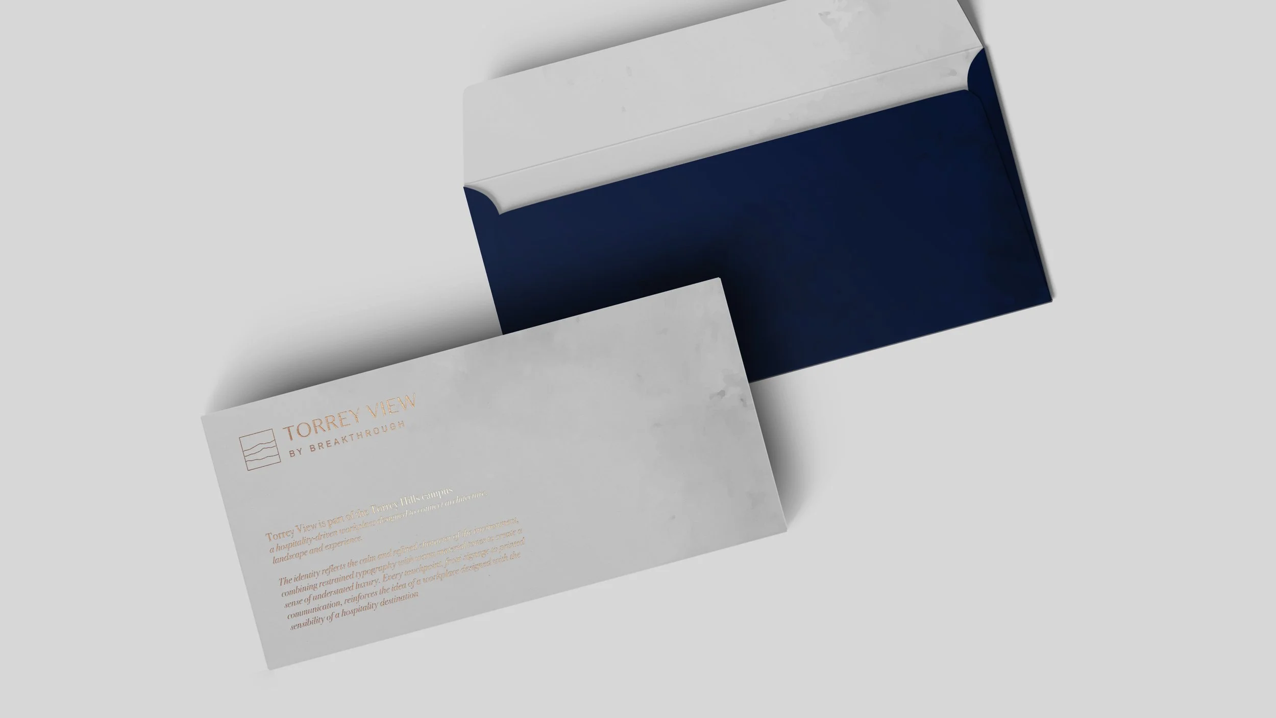
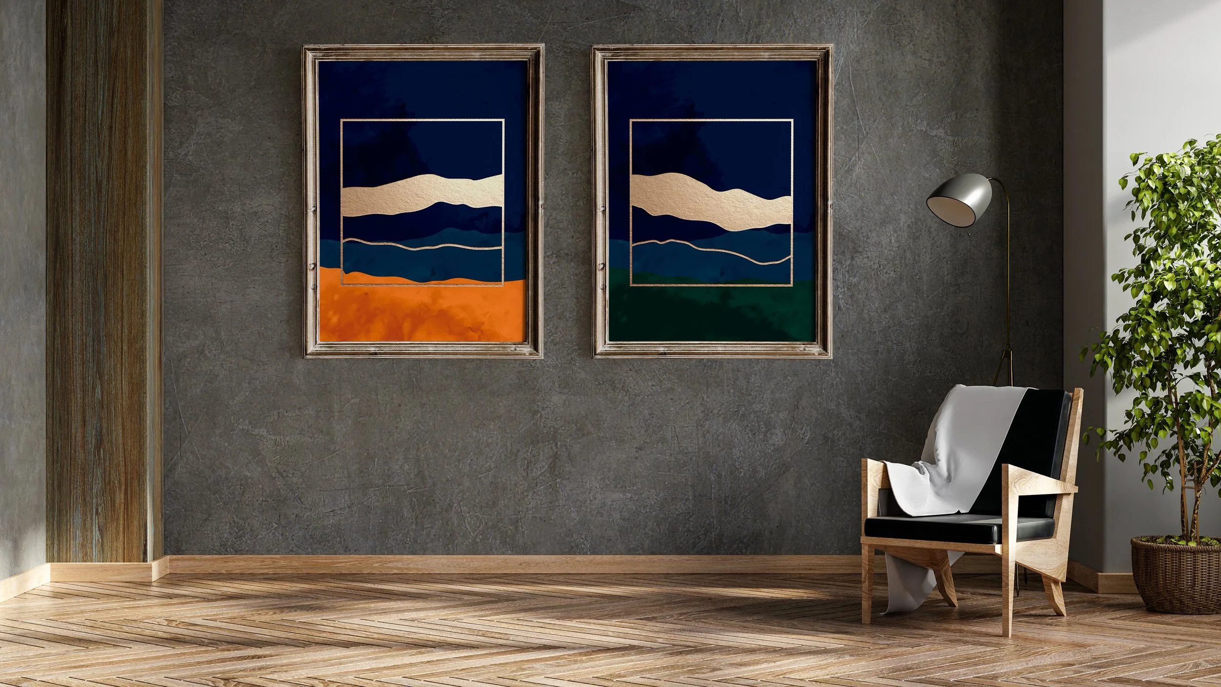
The mark abstracts the layered terrain of the hills into a system of forms – grounded, geological, quietly distinctive. Jewel tones with gradient depth replace the cold corporate palette of the previous identity. Warm metallic accents connect the brand to the material language of the architecture.
The result: a visual language that feels rooted in place, not imported from a brand manual.
The system
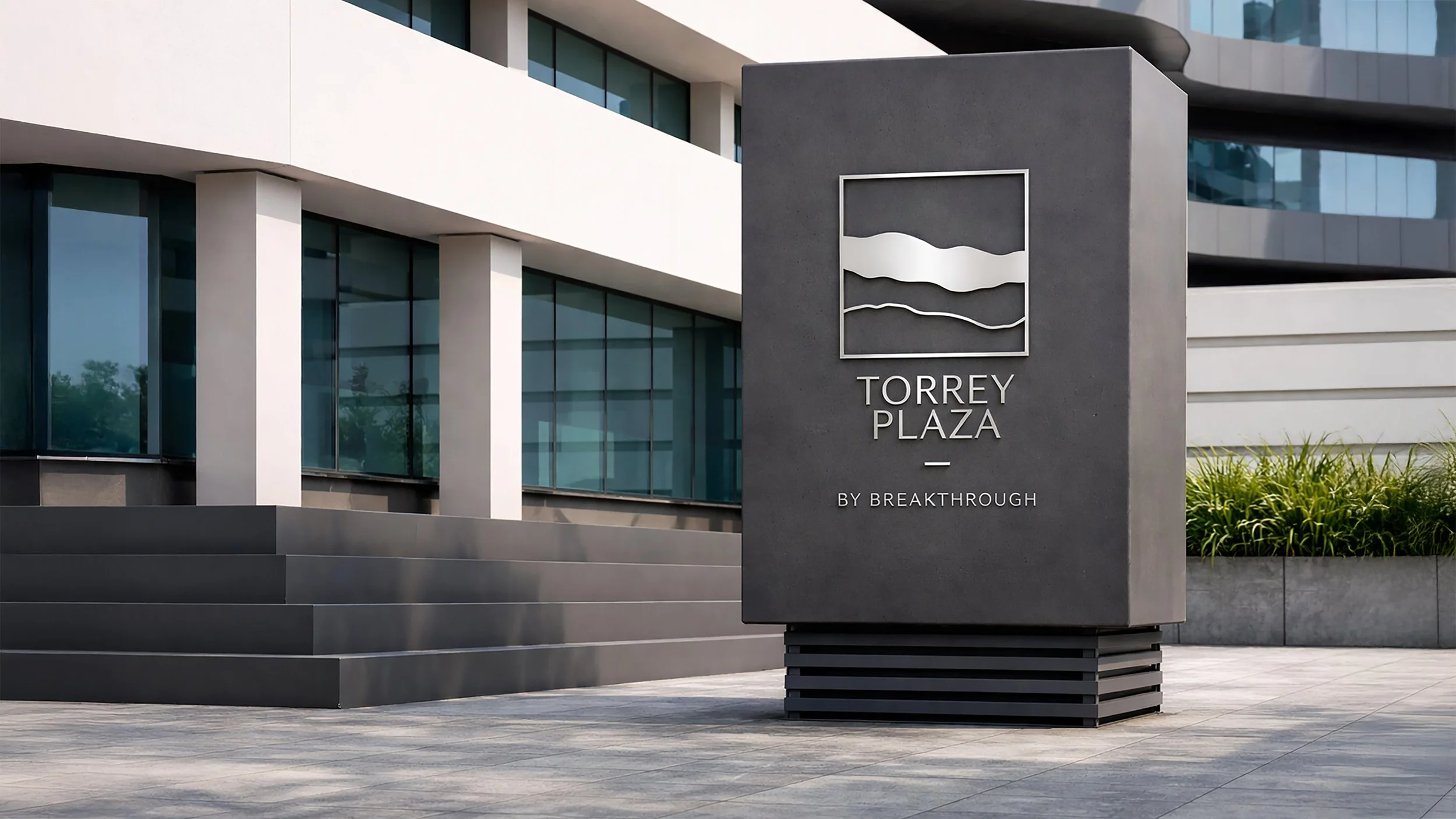
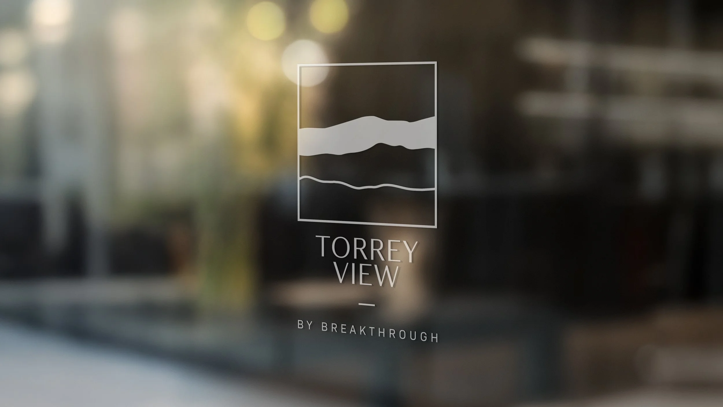
Each building gets its own variation of the core mark — Torrey View in blue diamond, Torrey Plaza in royal sapphire — while sharing the same structural logic. The system was designed from the start to accommodate five or six future Breakthrough properties across the US and globally, with each new location able to adopt the same architecture while expressing its own local identity.
Simple enough to apply at every scale. Distinctive enough to own a place.
In space
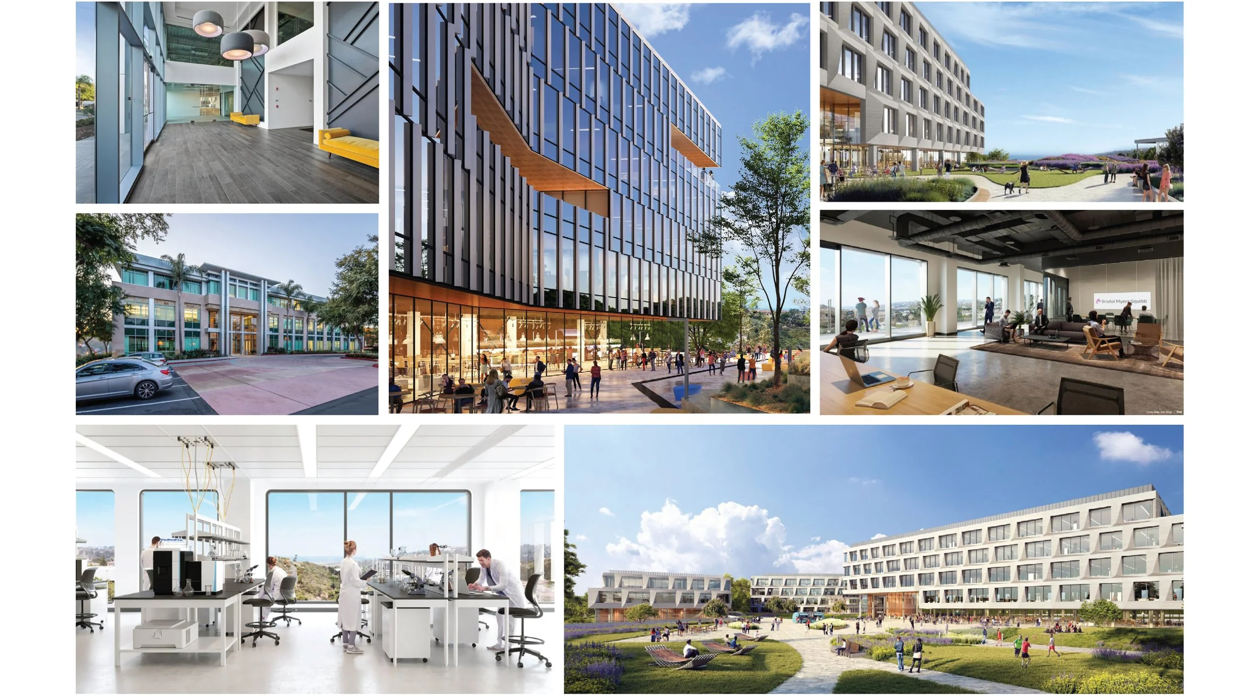
The identity was implemented across the full campus — lobby signage, wayfinding, glass applications, printed materials and leasing collateral. Working in physical space meant every decision had to survive real conditions: scale, light, material, distance.
This is where many brand systems fail. Forms that look clean on screen become ambiguous on a 3-metre wall. Colours that work in print disappear on frosted glass.
The Torrey Hills system was built with these constraints as the starting point, not an afterthought.
The result
A brand identity system deployed across two live campuses in San Diego — scalable, material-aware and built to grow with Breakthrough Properties as they expand.
Not a logo for a building. A system for a company finding its identity across America.
Selected projects
Nerivio
Ressono
The Belgrove