

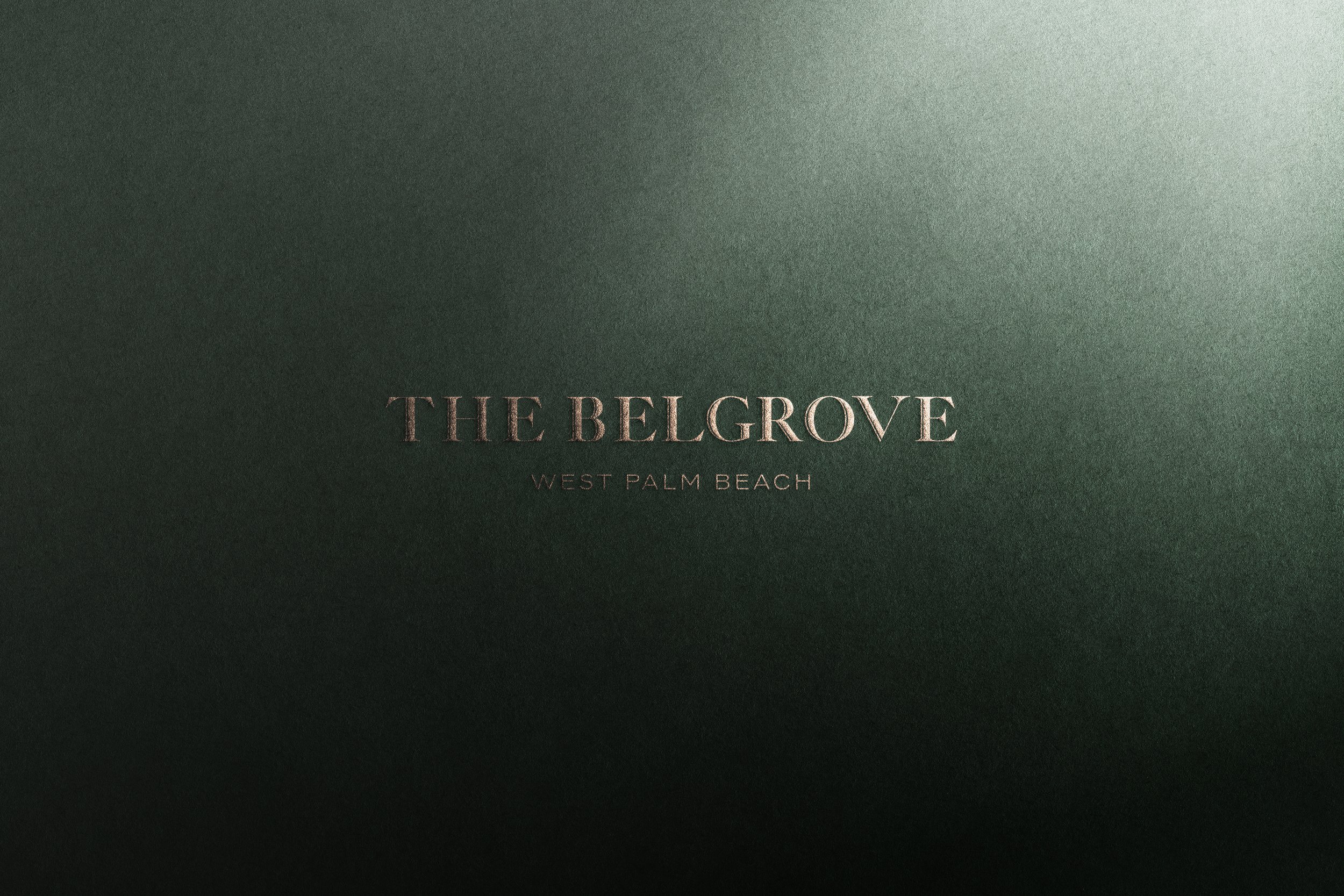
The Belgrove Hospitality Brand Identity — West Palm Beach, Florida
British structure. Caribbean ease.
One place where neither dominates.
The context
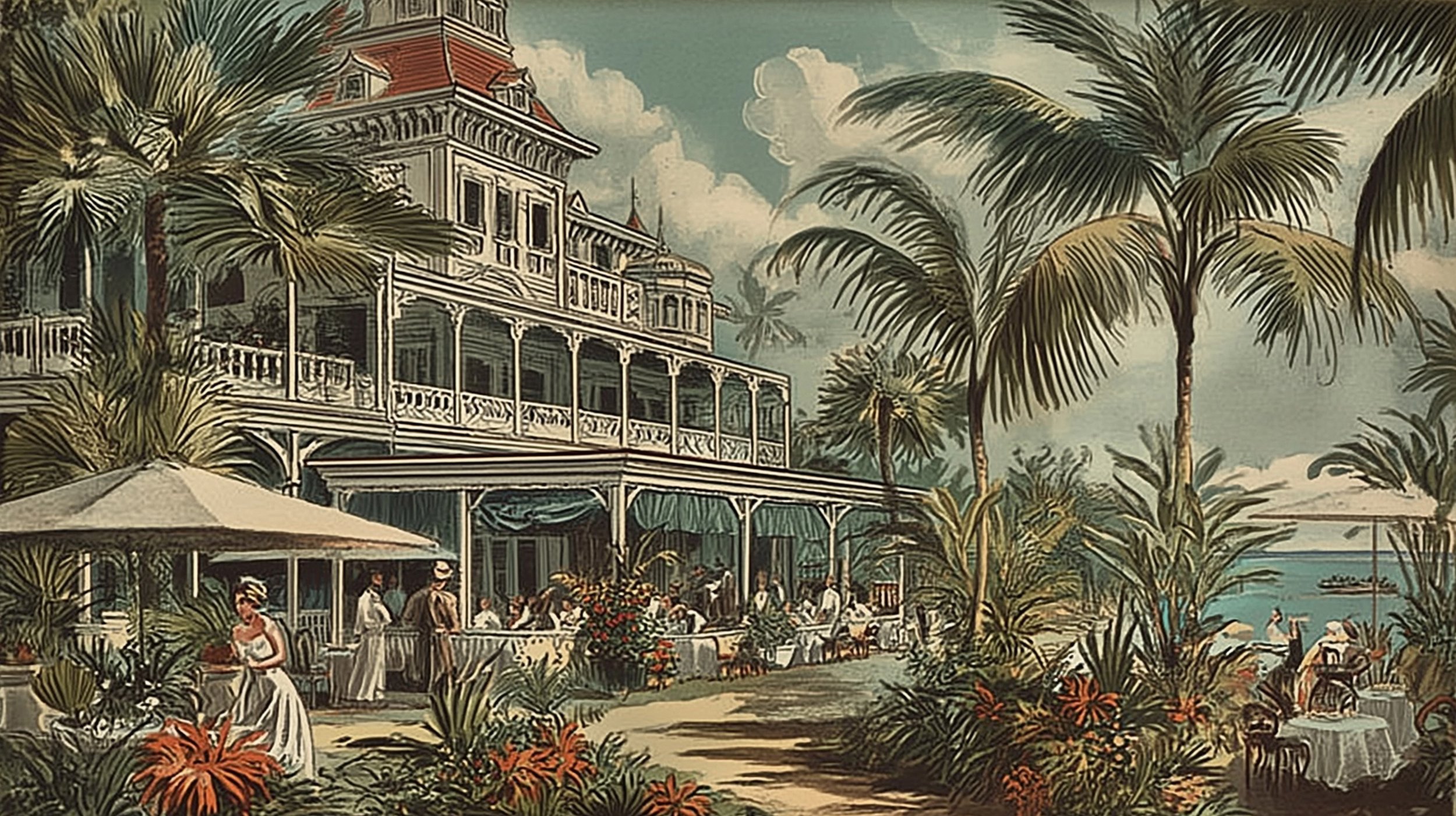
West Palm Beach, 1947. When the town sought incorporation, the original petition listed the name "Town of Magnolia Park." The State of Florida had other ideas — recognising the area's long history of mango cultivation, they christened it Mangonia Park instead.
A happy accident. A place named by nature rather than intention.
This is where The Belgrove is rooted.
The brief
The Belgrove is a luxury hospitality concept built on a specific cultural collision: British formality meeting Caribbean warmth. Afternoon tea and a rum bar. Precision and ease. Structure and spontaneity. The challenge was not to pick one side. It was to hold both — and make the tension feel intentional rather than confused. Hospitality brands typically resolve this kind of duality by flattening it. They choose one tone and decorate with the other. A British hotel with a tropical bar. A Caribbean resort with a formal restaurant. The Belgrove needed to be genuinely both. At the same time.
The system
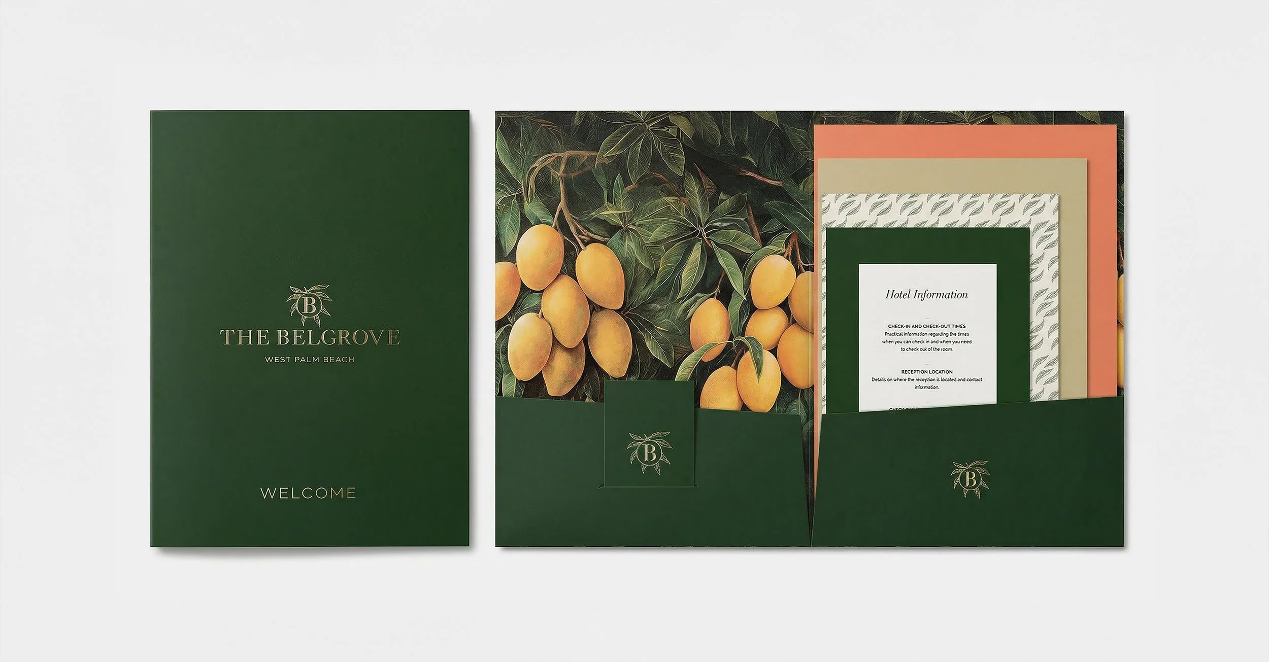
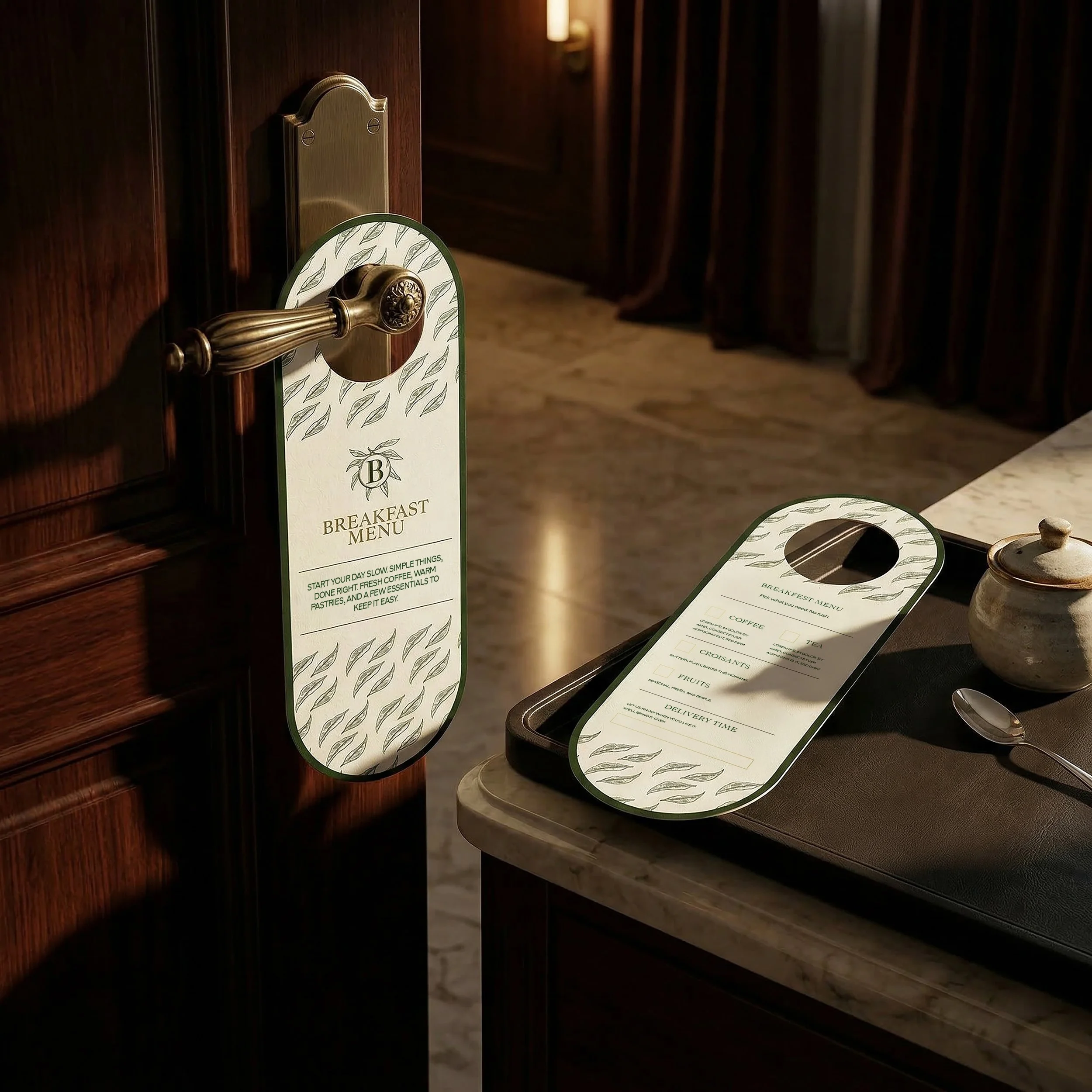
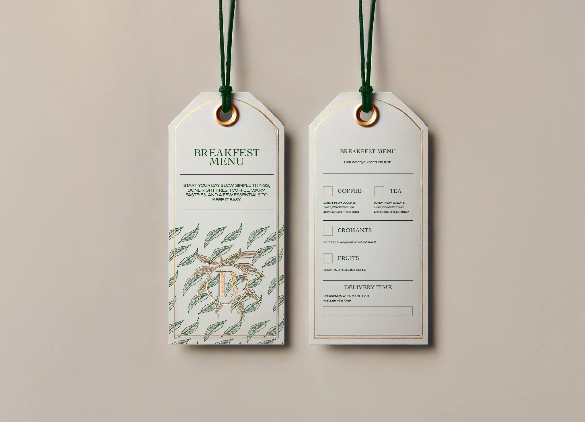
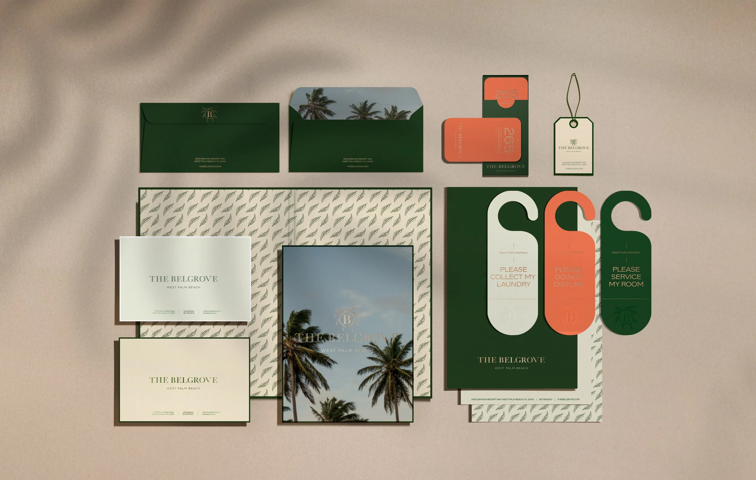
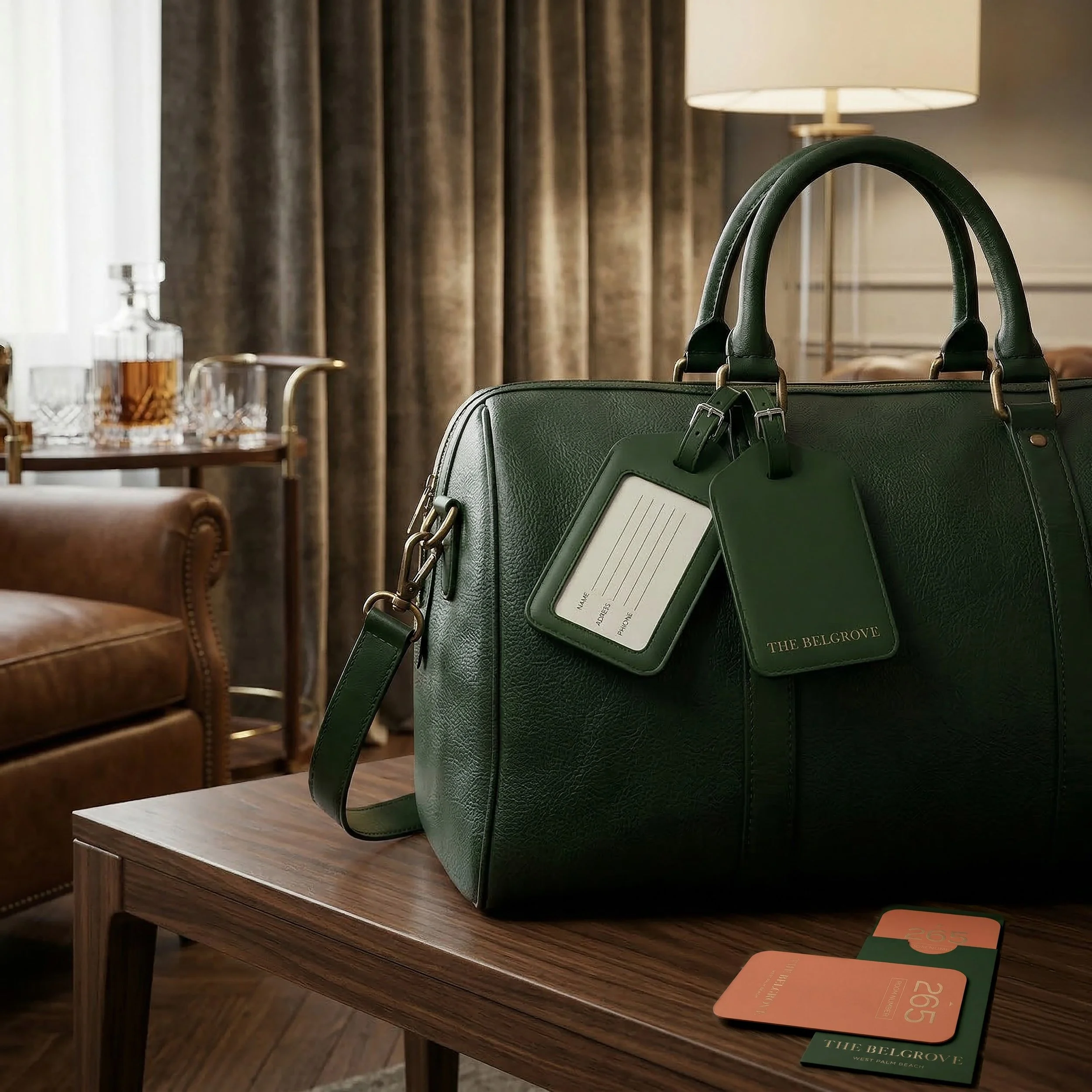
The brief defined eight distinct brand touchpoints — from arrival moments to parting impressions. Each one was designed as a connected part of a whole rather than a standalone gesture.
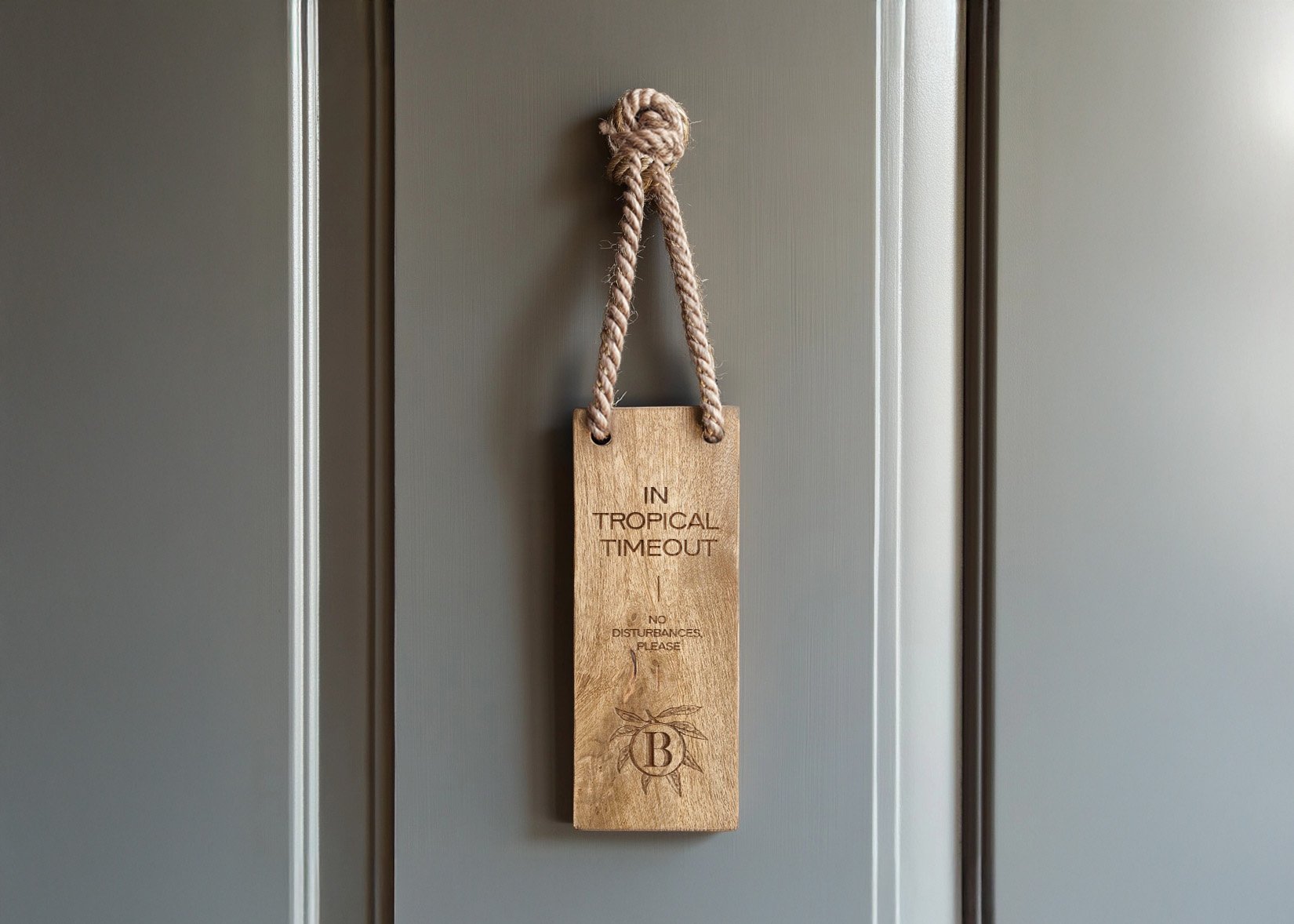
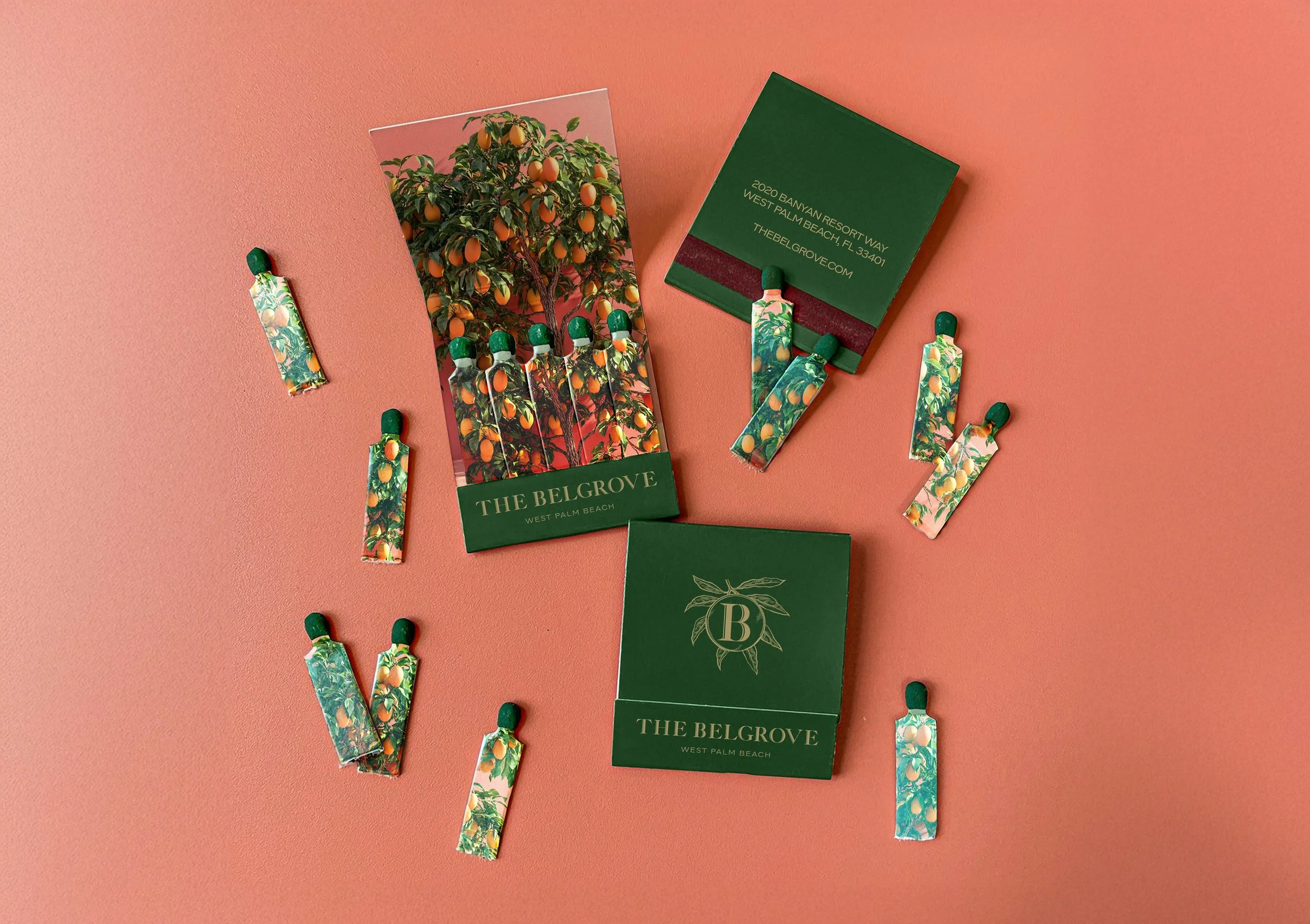
The signature scent carries through public spaces, guest rooms and spa treatments. The welcome drink — the Mangonia Breeze — ties the arrival moment to the history of the land. A physical ritual object placed in each room invites guests to set an intention and leave something behind. Small gestures, precisely placed, building a rhythm across the entire stay.
This is brand as choreography. Not as decoration.
The idea
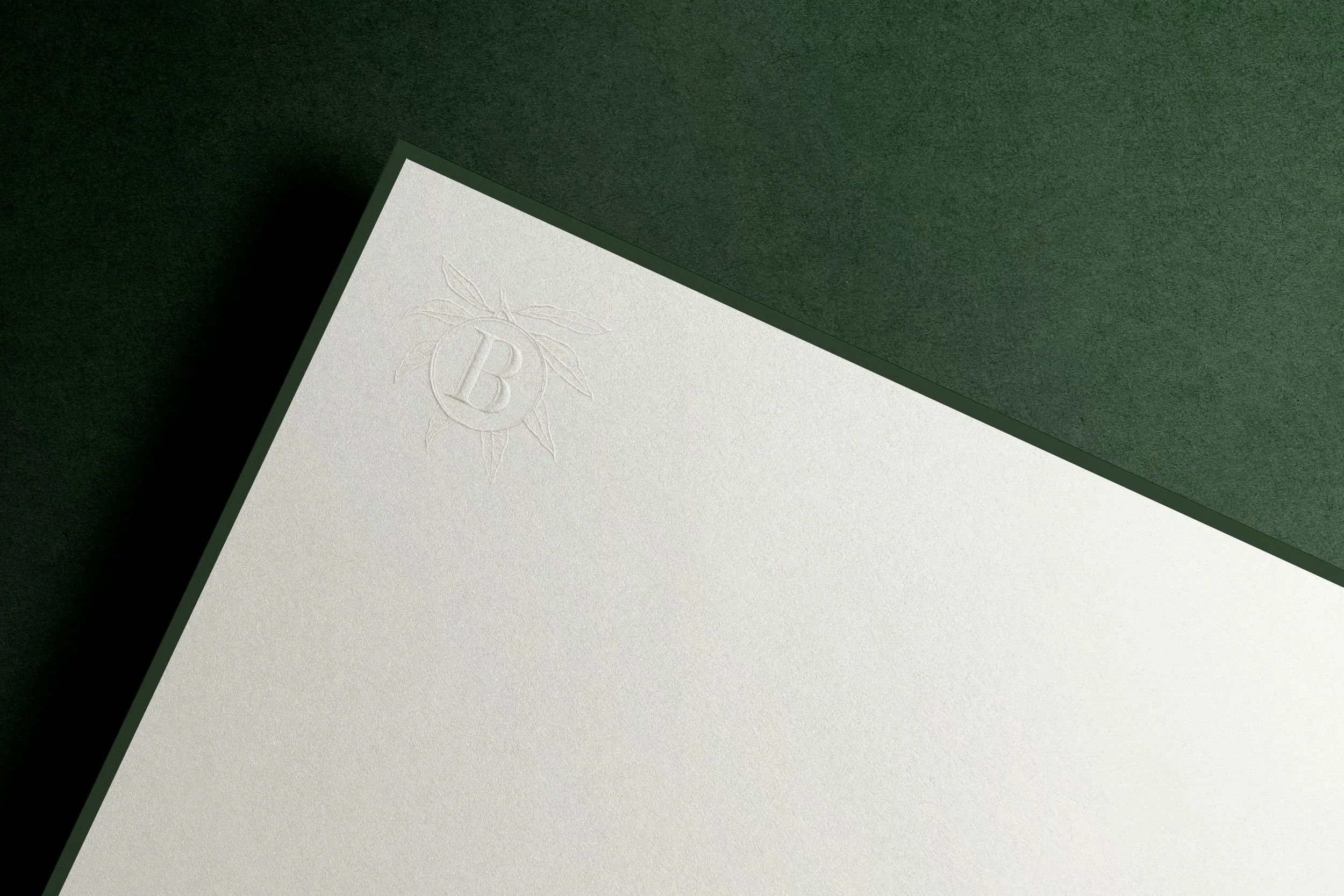
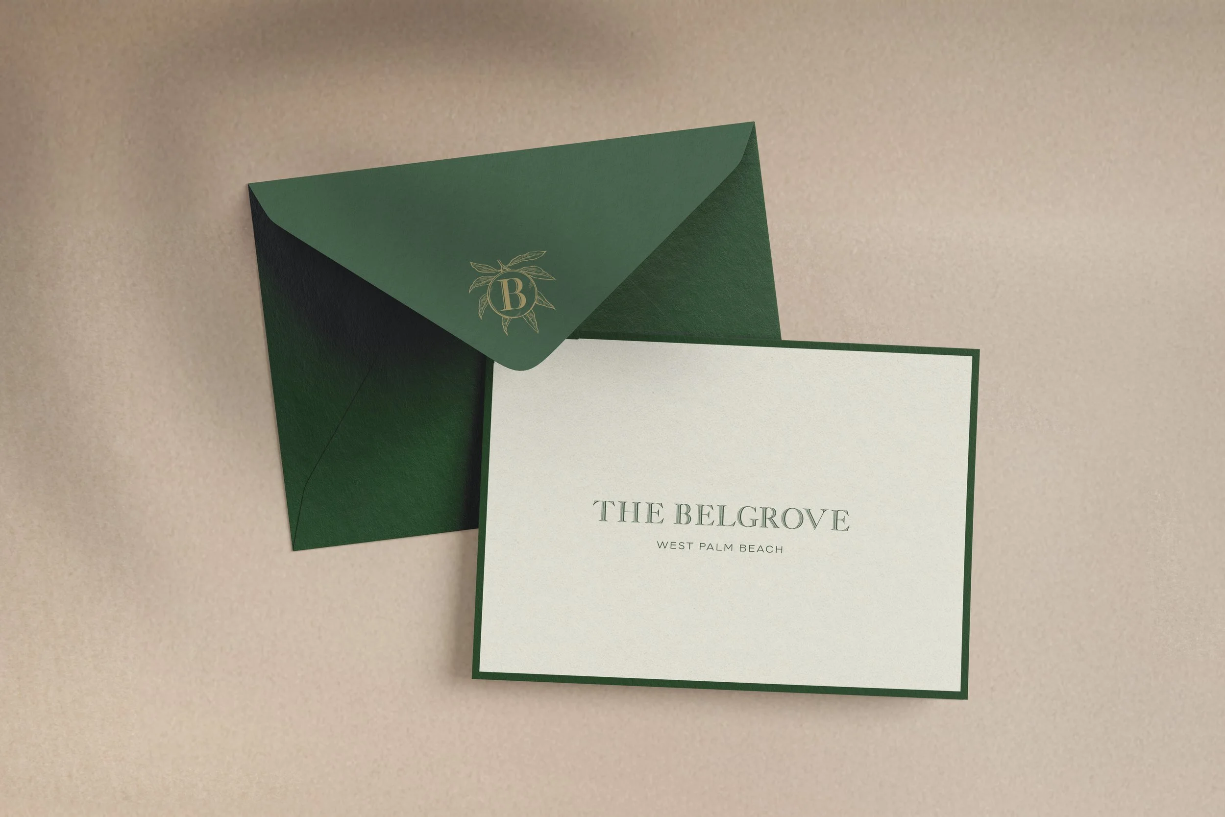
The mango is not a decorative motif here. It is the brand's founding symbol — revered across cultures as a sign of abundance, prosperity and the richness of life. Every element of the identity connects back to it: the colour palette built from mango coral, open mango yellow, British green and metallic gold; the naming system where colours carry personality ("Dark & Stormy", "Mango Leaf"); the arrival drink, the signature scent, the turndown ritual.
The brand doesn't just reference the place. It grows from it.
The result
A brand identity system built around atmosphere rather than service. One that shapes how a space is felt, not just how it looks.
The Belgrove doesn't ask guests to notice the brand. It asks them to feel it — in a scent, a ritual, a gesture at the end of the day.
That's where identity becomes experience.

A brand that lives across space, behaviour and small interactions
where every detail contributes to a consistent, memorable whole.
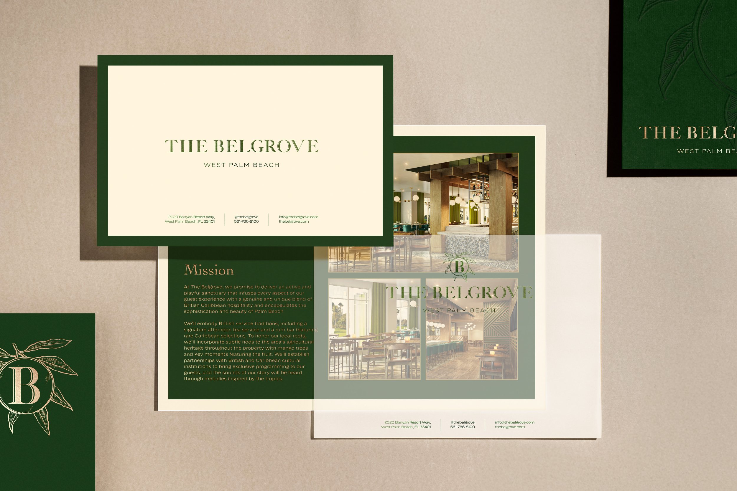
Atmosphere
The Belgrove balances precision with ease. The tone is refined but never distant, structured but never rigid
– shaped by British tradition and softened by Caribbean warmth.
The visual language
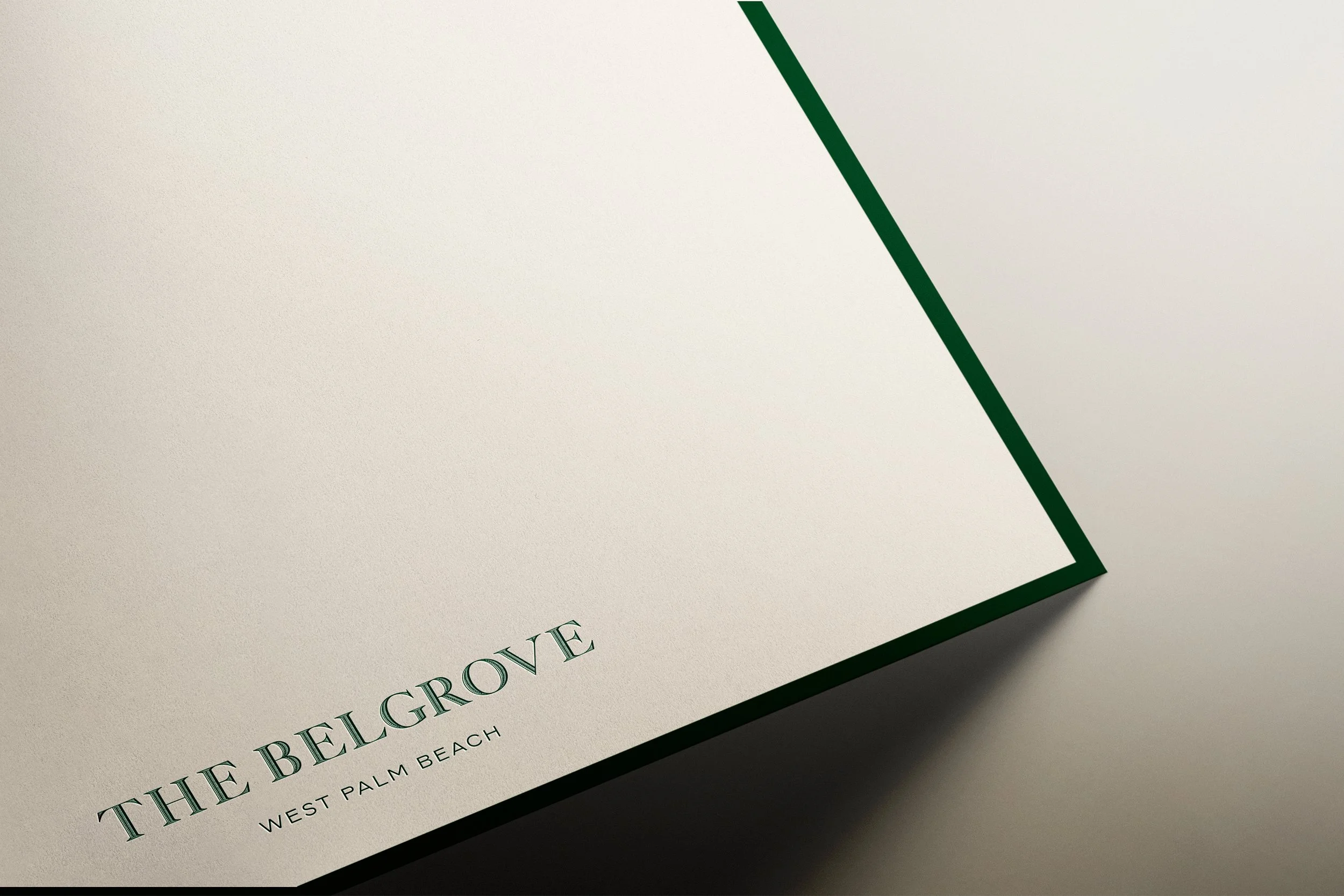
The identity holds the brand's central tension in every application. Typography is precise and quiet — British in its restraint. Colour is warm and alive — Caribbean in its confidence. Neither overwhelms the other.
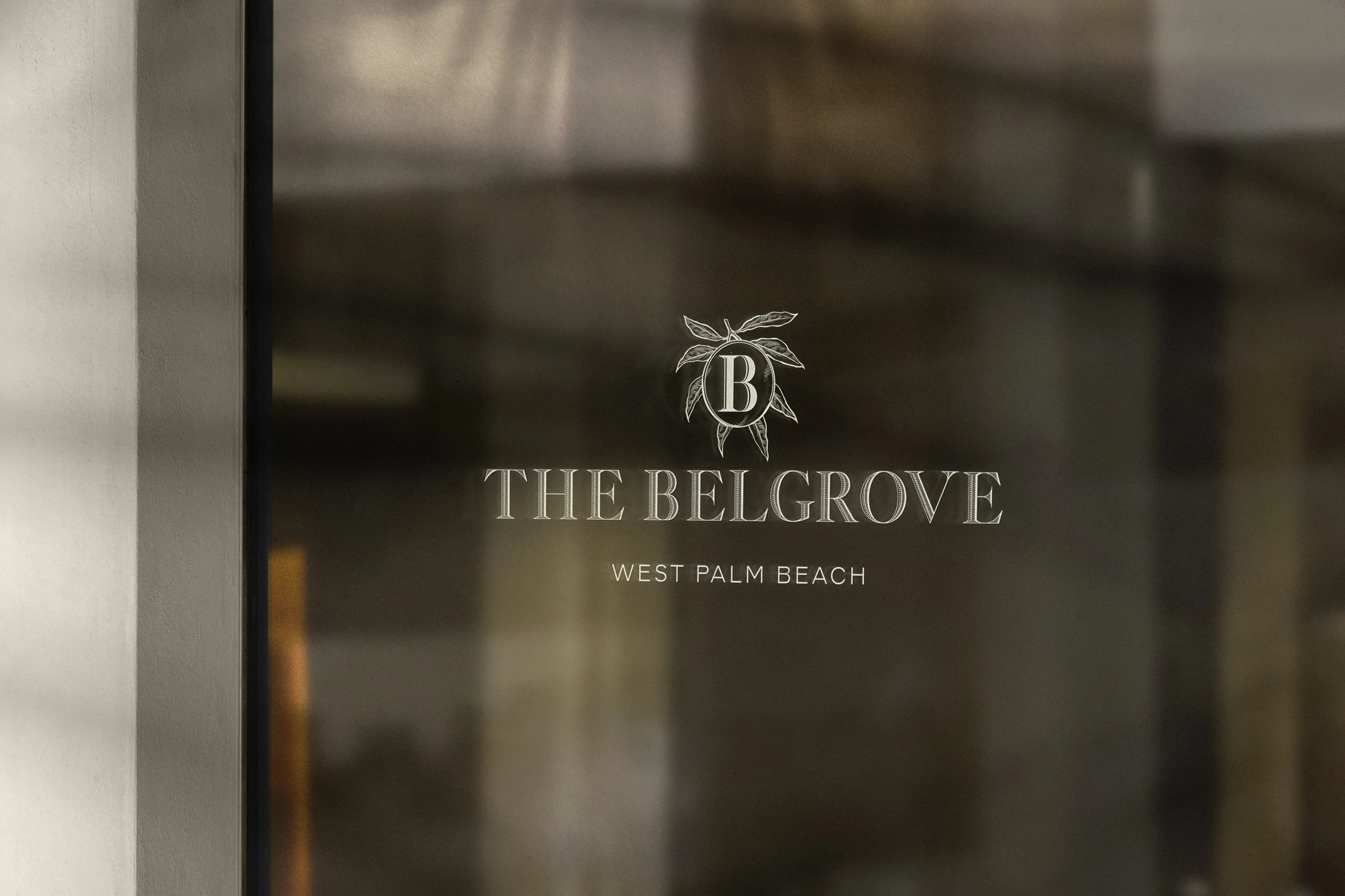
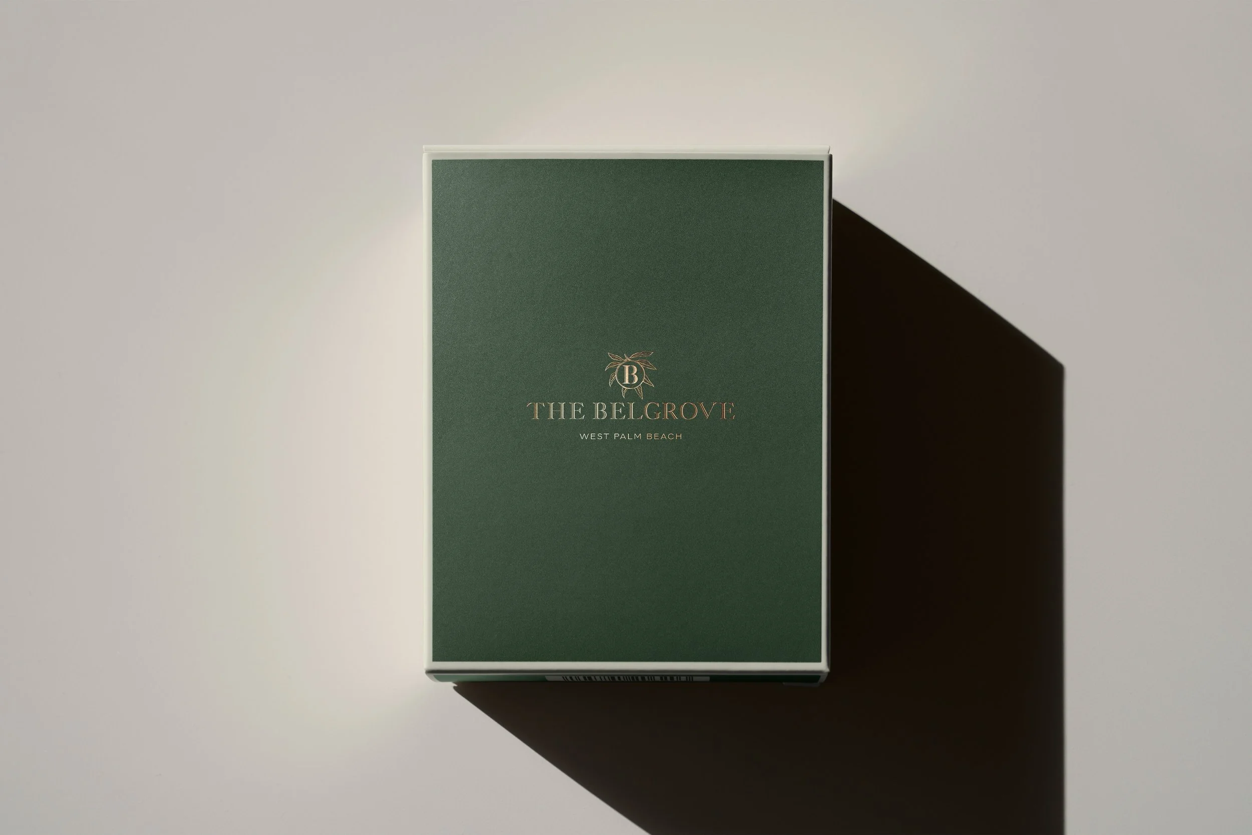
The logo works across embossed stationery, frosted glass, printed bags and environmental signage. It is designed to feel considered at every scale — from a matchbook to a hotel facade.
Selected projects
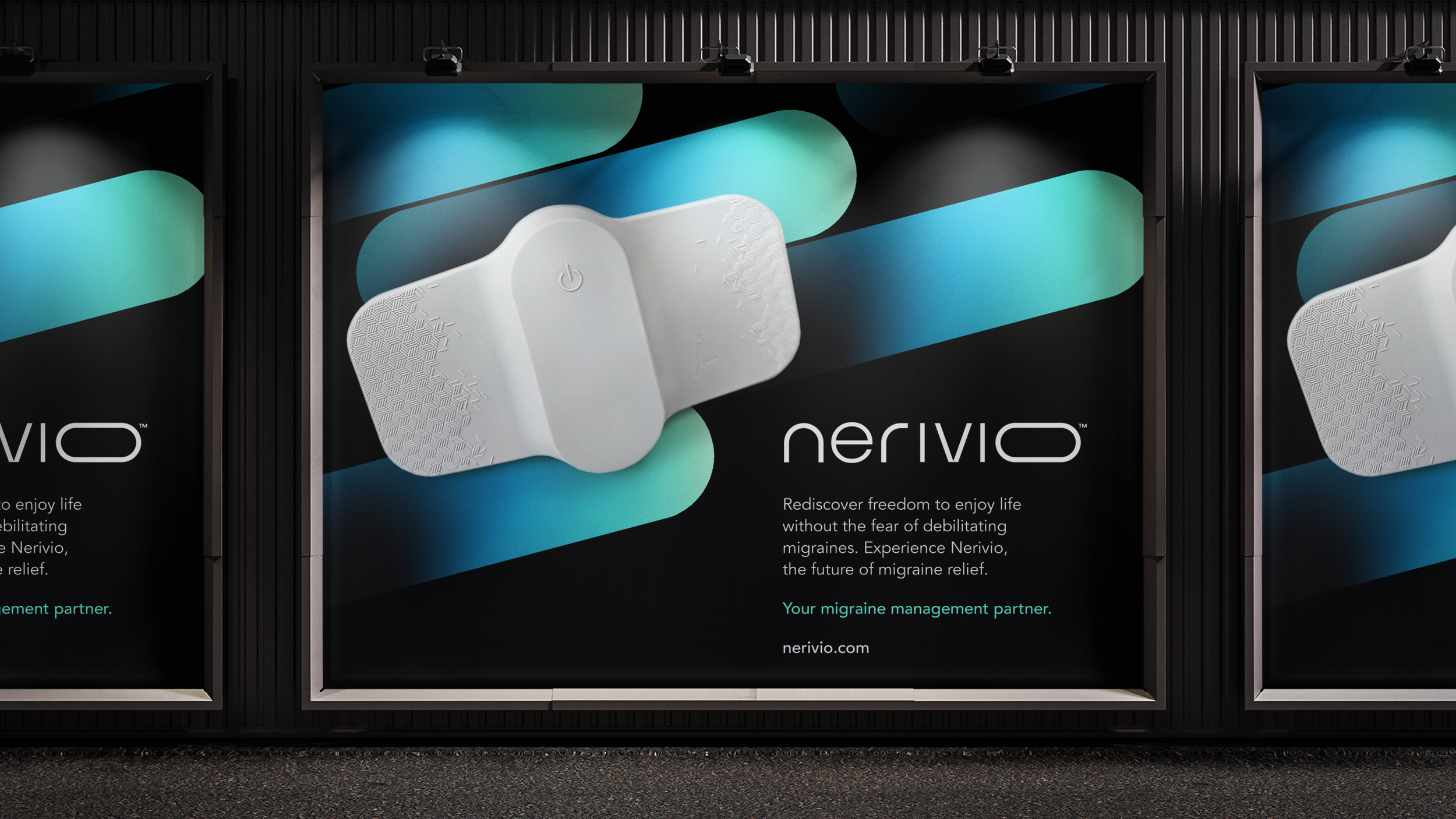
Nerivio
Ressono
Torrey Hills